To everything there is a season. And that goes for web design and development as surely as it goes for tulips in the spring. Since we launched UNLedu 4.0 in 2014, and refined it with 4.1 in 2016, much has changed. Since the last time we had a major release of the framework, the technologies and standards underlying the web, and the opportunities they afford us as web designers and developers, have again undergone a substantial transformation.

Once again, we’re on the threshold of a new era in web design
To understand how the standard technologies of the web intersect with our own design and development efforts, it’s helpful to rewind the clock and the calendar. To date, there have been three great eras of web development: textual, tables, and responsive.
Textual Era
The earliest, and the shortest-lived, was the Web that Tim Berners-Lee invented, a hyperlinked world of textual documents in which imagery or any sense of design was an afterthought. Almost all screens were on desktop computers or the occasional laptop, and outside of universities and large corporations, data was slow. Our Big Ten friends at the University of Minnesota had built Gopher several years prior, but Berners-Lee married some concepts of Gopher with then-current concepts of ‘hypermedia’ and came up with something new. Rather than Gopher’s rigid hierarchical structure of information, this new thing would link anything with anything; it was up to the author. It was like an alchemist creating gold. Here was the first effective hyperlinked medium where you could publish a thing, and have it read by a random stranger on the other side of the planet. It was the ‘WWW,’ the ‘World-Wide Web.’ For its time, it was perfect.
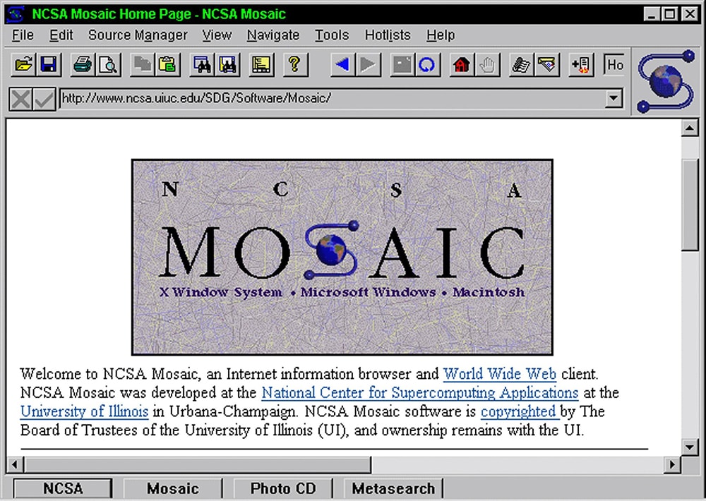
Of course, no technology is much good without an interface for humans, and our Big Ten friends at the University of Illinois’ National Center for Supercomputing Applications released the first graphical browser, Mosaic — forebear to Netscape and later, Firefox — onto the world in 1993.
Tables Era
When the original spec evolved through HTML 2.0 through 3.0, and with it saw the advent of the <table> tag, designers started to get interested. While designing anything using tables today would be an act of heresy, vandalism, or worse, at the time it was all opportunity: design elements could now be arranged spatially, in a primitive ‘grid’ of rows and columns. The engineers of HTML had intended tables for tabular data, but give designers an inch, and they’ll take a mile.

The Tables Era was where the Web began to be understood as a true mass market medium, a new ‘multi’-medium that could encompass all prior media, and, though few envisioned it at the time, a medium that would come to dominate mass communication and commerce. During this period, Cascading Style Sheets, an emerging spec that was mostly use for fonts and colors in the tables era began to quietly take its place as one leg of a three-legged stool of web development, along with the interaction technology JavaScript and of course, HTML.
Separation of style and content
The maturation of CSS, over time through the first decade of the century, allowed designers to completely separate the content in the HTML from presentation; tables were phased out and replaced with CSS. It wasn’t, mostly, apparent to end users, as websites looked pretty much the same, and were generally viewed on the same screens. Then came the iPhone, in 2007, and the notion of a truly high-quality browser on a mobile device. The need for a better way to deliver the web to small screens was soon apparent. First, that better way was found in using a server to deliver a different CSS stylesheet to mobile devices. It wasn’t perfect, but as a hack to support mobile, it worked.
Nebraska, after a policy decision announced at the State of the University Address in 2006, would in August 2007 introduce UNLedu 2.0. There were actually five different designs of the UNL homepage and templates over the prior 12 years since the web’s genesis; the ‘2.0’ wasn’t counting designs, it was declaring a change in the structure of the site as part of a maturation of the web as, in then-Chancellor Harvey Perlman’s words, “the most important way in which we can communicate to the world as an institution.” UNLedu 2.0 was the first high-scale shared web framework in higher ed. It was unusual enough at the time that the group was invited to present at that fall’s national HighEdWeb conference.
By the fall of 2009, UNLedu 3.0 had been launched, combining what had been learned from two years’ experience of living within a university website at unique scale and breadth, with a refreshed story-first presentation. Across the site, almost all Flash-based assets had been converted into open-standard equivalents, as it had become clear that Flash would not be part of the mobile revolution. 3.0 was a visual and strategic success, being recognized with a second eduStyle ‘Noteworthy’ mention on its release, along with ever-increasing traffic and engagement. Still, it was served to mobile devices through a slightly cumbersome and dissatisfying proxy-server method. Though everyone knew a near-infinite variety of screens and orientations were the future, we were still designing and developing for desktop first.

Responsive Era
Then along came Ethan Marcotte with a better way. In a groundbreaking 2010 A List Apart article, he defined a new concoction: responsive design. By joining some latent powers of HTML and CSS, along with a little Javascript, developers could deliver the ‘intelligence’ in the data stream sent to the browser to adapt the display ‘live’ on the device ... a great help when orientation sensors in phones (and later, tablets) could dynamically switch from portrait to landscape orientation, and back again.
Nebraska, by that point, had been building all of its sites atop a mature, shared codebase for almost four years, and updating it frequently. Not only could one imagine incorporating Marcotte’s sophisticated concepts into the UNLedu Web Framework (as it was by that time called) but not doing so would be professional malpractice. The team got to work on a ‘point-release’ of the 3.0 version of the framework, to be known as UNLedu 3.1.
Launched in the spring of 2012, UNL.edu 3.1 would make Nebraska the first major university to fully optimize its website(s) for mobile devices. Led by then-User Experience Architect Seth Meranda (now leading communications at Concordia University), the 3.1 effort would place Nebraska in the forefront of universities online, earning another featured presentation slot in that fall’s HighEdWeb national conference.
A ground-up rebuild to introduce a new visual design to replace the rapidly-aging 3.1 appearance, as well as to refine the codebase as we learned more, and more advanced, responsive techniques, would begin almost immediately. Launched in 2014, UNLedu 4.0 married ‘flat design’ with a richer color palette and a beautiful new set of fonts, atop the new HTML5 standard. Again, the team had done itself proud. UNLedu 4.0 ‘Wide Horizons’ would be recognized with the highest national award for websites given that fall by CASE (a Silver Award for Institutional Websites), and EduStyle’s highest honor (and the final one given in its nine-year run as chief arbiter of higher ed web design), the juried “Best Overall Website.” A design refinement by Senior Designer/Developer Ryan Dee would improve it once again for the current UNLedu Web Framework 4.1 ‘Rust Never Sleeps,’ launched in 2016.

The Performance Design Era
And we come to Right Now. The underlying technologies of the web are not done evolving. A little-noticed contribution, mostly from engineers at Microsoft, had been languishing in W3C for several years. It was a two-dimensional grid system that would return responsibilities for web layout to native capabilities within the browser itself. The brilliant Rachel Andrew, agent provacateur, web artiste and lately Editor in Chief of Smashing Magazine (the web industry's most influential publication), had been energetically proseletyzing this thing, called CSS Grid, since shortly after it had been proposed. As always, the browsers came after the standards, by necessity. And finally, in 2017, in a span of a few months, all of the relevant ones arrived in new releases with support for CSS Grid Level 1. This, by the way, is an age-old struggle for web developers: when is a technology sufficiently well-supported so that one can embrace it?
Since UNLedu 3.1 launched with its original responsive grid framework, Twitter had created Bootstrap and the design company Zurb had put out the Bootstrap competitor Foundation. Both, as open-source software, were fundamental to creating a web that works fully on mobile devices. But as always on the web, when fundamental capabilities based on open standards move to the browser, thus eliminating external logic and processing, it both speeds up rendering, because the browser renders natively, and it lightens the payload of data that must be sent between server and browser. Though there are some things outside of the scope of CSS Grid that these third-party frameworks may still meet a need for, for the main focus of Grid — rendering responsive, device-agnostic web pages — there will be no competition. In five years’ time, sites not built on Grid will be as rare as sites built with tables are now. Boom.
And, just in time, here comes UNLedu Web Framework 5
Native mobile apps have conditioned users to expect near-instant responsiveness from their devices. While UNL.edu currently is currently ranked by Google PageSpeed Insights among the fastest third of mobile websites, and in the middle third of desktop ‘full’ web pages, both clocking in under two seconds for a full page load and render, UNLedu Web Framework 5 will combine refined, modernized visual design with lighter-weight and higher performance assets. We expect, through lightening the payload of data that must be sent to the browser, and by utilizing higher-performing rendering technologies to ‘paint’ and animate the web page once the data arrives, to shave another third off those numbers. Our goal is to reach sub-1-second render times on both desktop and mobile.
Of course, performance is just a start, a baseline from which to build. With CSS Grid, we expect to be able to regain some of the near-infinite flexibility that designers have long enjoyed in print. We anticipate using animation and movement more frequently, where it adds context and meaning to the communication. White space. Text wraps. Besides the performance advantages of Grid, this new toolbox puts new power in the hands of web designers.
In the end, as here, it all goes back to content. Going forward, we expect to align communication strategy more deeply at all levels of the site to support the university’s most important goals of recruitment and retention. Because of WDN members’ outstanding contributions in content and design, UNL.edu delivered over 100 million page views last year* from 107,000 distinct UNL.edu URLs to people in 240 countries and island territories.
Our website is a calling card, an open book, and still, after nearly 25 years, a communication medium of unmatched reach. Please continue to watch the WDN website and this blog as we move toward the January 2019 release of UNLedu Web Framework 5.0.
* 584 million UNLedu pageviews have been counted by our Google Analytics account was activated on 12/9/2008. We have a lot of pages that don’t contain Google tracking code, though, due to privacy concerns. Our webfonts provider, Hoefler & Co., whose licenses are based on pageviews, reports that more than 100 million UNL pages were viewed last year using their webfonts.
** Senior Designer/Developer Ryan Dee helpfully pointed me to Jen Simmons' presentation last month at An Event Apart Seattle, where she described, in similar fashion, eras of web design and development. Simmons has five to this point; in looking at her list, she includes both fluid and fixed-width as separate eras (both of which I include here in the tables era; we referred to that ‘fluid’ period, with its percentage-based table columns, as ‘liquid’ in these parts), and includes one, "The Flash Era," that was never more than two asterisks here. So, YMMV. I'd argue, with extreme respect, that Flash wasn’t web development at all. It was substituting a proprietary technology for open web standards. A detour, not on the road to the destination. Simmons labels this new era, the one with CSS Grid at the center of the toolset, as “Intrinsic Design.” The idea is that, rather than putting up with — and designing around — the limitations of web technology, we can now make art or design with the open-standard web toolkit. It's been a long time coming. We’re about to see what we can do with it.
| Year | Percentage of visits |
|---|---|
| 2009 | .36% |
| 2010 | 2.17% |
| 2011 | 4.98% (tablets included) |
| 2012 | 8.96% |
| 2013 | 12.98% |
| 2014 | 20.03% |
| 2015 | 31.96% |
| 2016 | 38.2% |
| 2017 | 45.39% |