Digital Campus Framework (DCF) Classes
Element styles are applied directly to an element, while object, component and utility styles are applied by adding classes to the elements in the markup. These classes are prefixed with the dcf- namespace to avoid code collisions with third-party or custom styles. Styles specific to the University of Nebraska–Lincoln 5.0 theme are prefixed with the the unl- namespace. Please prefix your own custom styles with a namespace unique to your organization.
Objects
Wrapper
.dcf-wrapper- The wrapper object applies left and right padding to the page to provide adequate whitespace. Ensure that the wrapper object is added to the
<main>element to prevent content from colliding with the left and right edges of the browser viewport by default.
Related: Bleed (Objects)
Bleed
.dcf-bleed- The bleed object forces content to extend beyond the confines of the wrapper object, filling the browser viewport. The wrapper object can be nested inside the bleed object to reapply the page padding.
Related: Wrapper (Objects)
Grids
The Digital Campus Framework uses CSS Grid for grid-based layout and, using feature queries, provides a Flexbox-based fallback for browsers that don't support CSS Grid.
.dcf-grid- The grid object lays out child elements in a grid of twelve columns. Why twelve? Twelve is divisible by two, three, four and six, making it ideal for dividing a grid into halves, thirds, fourths and sixths.
.dcf-grid will take any number of child elements and place each in one of the available twelve columns. Additional classes to define column widths and column- and row-gap help to make the grid more useful.For the rest of the grid examples, we will apply column- and row-gap classes which are documented in Utilities.
Grid-related object classes can be appended with the framework's responsive suffixes (@sm, @md, @lg and @xl) to apply styles at the respective breakpoints.
.dcf-col-100%- Apply to a grid child element to define its column width as the full width of the grid. If you use any of the following column classes with responsive suffixes in your grid-based layout, you must also include
.dcf-col-100%. The grid will not automatically create a single column for your grid content.
.dcf-col-100%.dcf-col-50%-start- Apply to a grid child element to define the column width as one-half of the grid and locate it on the left side, at the start of the grid's tracks.
.dcf-col-50%-start.dcf-col-50%-center- Apply to a grid child element to define the column width as one-half of the grid and locate it in the center of the grid's tracks.
.dcf-col-50%-center.dcf-col-50%-end- Apply to a grid child element to define the column width as one-half of the grid and locate it on the right side, at the end of the grid's tracks.
.dcf-col-50%-end.dcf-col-50%- Apply to a grid child element to define the column width as one-half of the grid and locate it anywhere on the grid's tracks based on the position of its sibling grid columns.
.dcf-col-50%.dcf-col-33%-start- Apply to a grid child element to define the column width as one-third of the grid and locate it on the left side, at the start of the grid's tracks.
.dcf-col-33%-start.dcf-col-33%-center- Apply to a grid child element to define the column width as one-third of the grid and locate it in the center of the grid's tracks.
.dcf-col-33%-center.dcf-col-33%-end- Apply to a grid child element to define the column width as one-third of the grid and locate it on the right side, at the end of the grid's tracks.
.dcf-col-33%-end.dcf-col-33%- Apply to a grid child element to define the column width as one-third of the grid and locate it anywhere on the grid's tracks based on the position of its sibling grid columns.
.dcf-col-33%.dcf-col-67%-start- Apply to a grid child element to define the column width as two-thirds of the grid and locate it on the left side, at the start of the grid's tracks.
.dcf-col-67%-start.dcf-col-67%-center- Apply to a grid child element to define the column width as two-thirds of the grid and locate it in the center of the grid's tracks.
.dcf-col-67%-center.dcf-col-67%-end- Apply to a grid child element to define the column width as two-thirds of the grid and locate it on the right side, at the end of the grid's tracks.
.dcf-col-67%-end.dcf-col-67%- Apply to a grid child element to define the column width as two-thirds of the grid and locate it anywhere on the grid's tracks based on the position of its sibling grid columns.
.dcf-col-67%.dcf-col-25%-start- Apply to a grid child element to define the column width as one-fourth of the grid and locate it on the left side, at the start of the grid's tracks.
.dcf-col-25%-start.dcf-col-25%-end- Apply to a grid child element to define the column width as one-fourth of the grid and locate it on the right side, at the end of the grid's tracks.
.dcf-col-25%-end.dcf-col-25%- Apply to a grid child element to define the column width as one-fourth of the grid and locate it anywhere on the grid's tracks based on the position of its sibling grid columns.
.dcf-col-25%.dcf-col-75%-start- Apply to a grid child element to define the column width as three-fourths of the grid and locate it on the left side, at the start of the grid's tracks.
.dcf-col-75%-start.dcf-col-75%-end- Apply to a grid child element to define the column width as three-fourths of the grid and locate it on the right side, at the end of the grid's tracks.
.dcf-col-75%-end.dcf-col-75%- Apply to a grid child element to define the column width as three-fourths of the grid and locate it anywhere on the grid's tracks based on the position of its sibling grid columns.
.dcf-col-75%Grids of equal-width columns can more easily be created using the following grid objects instead of applying classes to each and every grid column in the twelve-column grid.
.dcf-grid-full- The grid-full object lays out child elements in a single column grid.
.dcf-grid-halves- The grid-halves object lays out child elements in a grid of two equal-width columns.
.dcf-grid-thirds- The grid-thirds object lays out child elements in a grid of three equal-width columns.
.dcf-grid-fourths- The grid-fourths object lays out child elements in a grid of four equal-width columns.
Grids of five and six equal-width columns start at the @md breakpoint because there is not enough horizontal space to reasonably accommodate most content in such narrow columns for widths below the @md breakpoint.
.dcf-grid-fifths@md- The grid-fifths object lays out child elements in a grid of five equal-width columns for breakpoints greater than or equal to
@md. It must be suffixed with@md,@lgor@xl.
.dcf-grid-sixths@md- The grid-sixths object lays out child elements in a grid of six equal-width columns for breakpoints greater than or equal to
@md. It must be suffixed with@md,@lgor@xl.
Related: Box Alignment (Utilities), Grid (Utilities)
Media
.dcf-media- The media object consists of a single piece of media (e.g., photo, icon, video) located next to a block of text. The media object prevents the text from wrapping around the media.
.dcf-media-body- The media body is the block of text in the media object.
Etiam porta sem malesuada magna mollis euismod. Duis mollis, est non commodo luctus, nisi erat porttitor ligula, eget lacinia odio sem nec elit. Donec id elit non mi porta gravida at eget metus. Pellentesque ornare sem lacinia quam venenatis vestibulum. Duis mollis, est non commodo luctus, nisi erat porttitor ligula, eget lacinia odio sem nec elit.
<div class="dcf-media">
  <div class="dcf-mr-4">
    <img src="https://via.placeholder.com/100x100" alt="Placeholder image.">
  </div>
  <div class="dcf-media-body">
    <p class="dcf-w-max-lg">Etiam porta sem malesuada magna mollis euismod. Duis mollis, est non commodo luctus, nisi erat porttitor ligula, eget lacinia odio sem nec elit. Donec id elit non mi porta gravida at eget metus. Pellentesque ornare sem lacinia quam venenatis vestibulum. Duis mollis, est non commodo luctus, nisi erat porttitor ligula, eget lacinia odio sem nec elit.</p>
  </div>
</div>
Components
- Accordions (Collapsible Content)
- Badges
- Blockquotes
- Buttons
- Cards
- Code
- Datepickers
- Figures
- Forms
- Headings
- Input Groups
- Lists
- Modals
- Notices
- Pagination
- Slideshows
- Tables
- Tabs
- Videos
Accordions (Collapsible Content)
See Details & Summary (Elements)
Badges
.dcf-badge- This includes styles common to all badges and requires the addition of one of the following modifier classes to fully style a badge.
Roundrect Badges
.dcf-badge-roundrect- Use this modifier for a badge with roundrect shape.
h1. Heading with roundrect badge New
h2. Heading with roundrect badge New
h3. Heading with roundrect badge New
h4. Heading with roundrect badge New
h5. Heading with roundrect badge New
h6. Heading with roundrect badge New
Paragraph with roundrect badge New
Pill Badges
.dcf-badge-pill- Use this modifier for a badge with pill shape.
h1. Heading with pill badge New
h2. Heading with pill badge New
h3. Heading with pill badge New
h4. Heading with pill badge New
h5. Heading with pill badge New
h6. Heading with pill badge New
Paragraph with pill badge New
Blockquotes
.dcf-blockquote- Like inline quotes (
<q>), the blockquote component automatically adds quotation marks—no need to add your own. .dcf-attribution- To attribute the source of a quote, put the attribution in a
<footer>element with thedcf-attributionclass. It will automatically prepend an em dash (—) followed by a thin space ( ). If the attribution source comes from a creative work, it should be cited using the<cite>element and italicized with the<i>element to visually offset the title of the work from the rest of the attribution.
Lorem ipsum dolor sit amet, consectetur adipiscing elit. Aenean eu leo quam. Pellentesque ornare sem lacinia quam venenatis vestibulum.
Related: Blockquotes (Elements), Quotes (Elements)
Buttons
Buttons include the <button> element, as well as form inputs (type="button" and type="submit") and links styled to appear as buttons.
.dcf-btn- This includes styles common to all buttons and requires the addition of one of the following modifier classes to fully style a button.
Primary Buttons
.dcf-btn-primary- Use the primary modifier to give standard emphasis to a button.
Secondary Buttons
.dcf-btn-secondary- Visually de-emphasize buttons by using the secondary modifier.
Tertiary Buttons
.dcf-btn-tertiary- Visually de-emphasize buttons by using the tertiary modifier.
Inverse Primary Buttons
.dcf-btn-inverse-primary- Use the inverse primary modifier to give standard emphasis to a button on a dark background.
Inverse Secondary Buttons
.dcf-btn-inverse-secondary- Visually de-emphasize buttons on a dark background by using the inverse secondary modifier.
Inverse Tertiary Buttons
.dcf-btn-inverse-tertiary- Visually de-emphasize buttons on a dark background by using the inverse tertiary modifier.
Button State: Active
Button State: Disabled
Buttons With Icons
.dcf-btn-icon- Button with an icon
<div class="dcf-d-flex dcf-flex-wrap dcf-gap-2">
                  <button class="dcf-btn dcf-btn-primary dcf-btn-icon" type="button">Primary Button
                    <svg class="dcf-fill-current" aria-hidden="true" focusable="false" height="16" width="16" viewBox="0 0 48 48">
                      <path d="M18 36a17.9 17.9 0 0 0 11.27-4l15.31 15.41a2 2 0 0 0 2.84-2.82L32.08 29.18A18 18 0 1 0 18 36zm0-32A14 14 0 1 1 4 18 14 14 0 0 1 18 4z"></path>
                    </svg>
                  </button>
                  <button class="dcf-btn dcf-btn-secondary dcf-btn-icon" type="button">Secondary Button
                    <svg class="dcf-fill-current" aria-hidden="true" focusable="false" height="16" width="16" viewBox="0 0 48 48">
                      <path d="M18 36a17.9 17.9 0 0 0 11.27-4l15.31 15.41a2 2 0 0 0 2.84-2.82L32.08 29.18A18 18 0 1 0 18 36zm0-32A14 14 0 1 1 4 18 14 14 0 0 1 18 4z"></path>
                    </svg>
                  </button>
                  <button class="dcf-btn dcf-btn-tertiary dcf-btn-icon" type="button">Tertiary Button
                    <svg class="dcf-fill-current" aria-hidden="true" focusable="false" height="16" width="16" viewBox="0 0 48 48">
                      <path d="M18 36a17.9 17.9 0 0 0 11.27-4l15.31 15.41a2 2 0 0 0 2.84-2.82L32.08 29.18A18 18 0 1 0 18 36zm0-32A14 14 0 1 1 4 18 14 14 0 0 1 18 4z"></path>
                    </svg>
                  </button>
                </div>
Button Groups
.dcf-btn-group- Group two or more buttons together.
Switch Buttons
.dcf-input-switch- Style a radio input like a button inside a button group.
dcf-form-group dcf-d-inline-flex dcf-flex-nowrap dcf-p-1 dcf-rounded dcf-b-1 dcf-b-solid unl-b-light-gray.<form class="dcf-form" action="?" method="post">
<fieldset class="dcf-m-0 dcf-p-0 dcf-b-0">
<legend class="dcf-legend">Campus</legend>
<div class="dcf-form-group dcf-d-inline-flex dcf-flex-nowrap dcf-p-1 dcf-rounded dcf-b-1 dcf-b-solid unl-b-light-gray">
<div class="dcf-input-switch">
<input id="campus-city" name="campus" type="radio" value="city" checked>
<label for="campus-city">City</label>
</div>
<div class="dcf-input-switch">
<input id="campus-east" name="campus" type="radio" value="east">
<label for="campus-east">East</label>
</div>
<div class="dcf-input-switch">
<input id="campus-innovation" name="campus" type="radio" value="innovation">
<label for="campus-innovation">Innovation</label>
</div>
</div>
</fieldset>
</form>
Related: Forms (Elements), Forms (Components), Gap (Utilties), Icons, Input Groups (Components)
Cards
.dcf-card- A card is a commonly-used design pattern that groups related content in a container that resembles a physical playing card.
.dcf-card-block- The card block provides padding for text inside the card. Card contents that need to span the full width (like an image) should be placed outside of the card block.
-
Card #1
Donec sed odio dui. Lorem ipsum dolor sit amet, consectetur adipiscing elit. Nulla vitae elit libero, a pharetra augue. Maecenas sed diam eget risus varius blandit sit amet non magna.
-
Card #2 with a super, duper long title
Nulla vitae elit libero, a pharetra augue. Donec ullamcorper nulla non metus auctor fringilla. Vivamus sagittis lacus vel augue laoreet rutrum faucibus dolor auctor. Cum sociis natoque penatibus et magnis dis parturient montes, nascetur ridiculus mus. Maecenas sed diam eget risus varius blandit sit amet non magna. Aenean lacinia bibendum nulla sed consectetur.
-
Card #3
Lorem ipsum dolor sit amet, consectetur adipiscing elit. Etiam porta sem malesuada magna mollis euismod. Maecenas sed diam eget risus varius blandit sit amet non magna. Praesent commodo cursus magna, vel scelerisque nisl consectetur et.
-
Card #4
Integer posuere erat a ante venenatis dapibus posuere velit aliquet. Integer posuere erat a ante venenatis dapibus posuere velit aliquet. Lorem ipsum dolor sit amet, consectetur adipiscing elit. Sed posuere consectetur est at lobortis. Aenean lacinia bibendum nulla sed consectetur.
Optionally, a card can be turned into a link. However, there are usability and accessibility issues with simply wrapping a card with an <a>. Instead, use the following classes and JavaScript to enable this functionality.
.dcf-card-as-link- Add to a card to turn the whole card into a link.
.dcf-card-link- The card needs a link defined to be used for the whole card. Apply this class to your source link.
Example Card
Integer posuere erat a ante venenatis dapibus posuere velit aliquet. Integer posuere erat a ante venenatis dapibus posuere velit aliquet. Lorem ipsum dolor sit amet, consectetur adipiscing elit. Sed posuere consectetur est at lobortis. Aenean lacinia bibendum nulla sed consectetur.
Go to Home Page<div class="dcf-card dcf-card-as-link dcf-d-flex dcf-flex-col dcf-bg-white">
<div class="dcf-card-block dcf-2nd">
<h3 class="dcf-txt-h4">Example Card</h3>
<p>Integer posuere erat a ante venenatis dapibus posuere velit aliquet. Integer posuere erat a ante venenatis dapibus posuere velit aliquet. Lorem ipsum dolor sit amet, consectetur adipiscing elit. Sed posuere consectetur est at lobortis. Aenean lacinia bibendum nulla sed consectetur.</p>
<a class="dcf-card-link dcf-btn dcf-btn-primary" href="https://www.unl.edu">Go to Home Page</a>
</div>
<img class="dcf-1st" src="https://via.placeholder.com/800x600" alt="Placeholder image.">
</div>
<script>
window.addEventListener('inlineJSReady', function() {
WDN.initializePlugin('card-as-link');
}, false);
</script>Related: Lists (Elements), Grids (Objects), Unstyled Lists (Components), Grid (Utilities), Flexbox (Utilities), Order (Utilities)
Code
.dcf-pre- Retain code styling for multiple lines of code wrapped with
<pre>element.
<p>Morbi leo risus, porta ac consectetur ac, vestibulum at eros.</p>
    <p>Nulla vitae elit libero, a pharetra augue.</p>
Related: Code (Elements)
Datepickers
.dcf-datepicker- This class is applied to the wrapper
<div>and is what the JavaScript targets to add functionality.
<form class="dcf-form" action="#" method="get">
  <div class="dcf-datepicker">
    <label for="sample-date">Date 2</label>
    <input id="sample-date" type="text" name="sample-date">
  </div>
</form>
<script>
  window.addEventListener('inlineJSReady', function() {
    WDN.initializePlugin('datepickers');
  }, false);
</script>
Note: Be sure to replace sample-date with an id and name of your own.
Related: Buttons (Components), Forms (Elements), Forms (Components), Input Groups (Components)
Figures
.dcf-figcaption- Figures do not require any additional classes, but
.dcf-figcaptionprovides consistent styles for the<figcaption>. It reduces the font-size and lightens the text to help distinguish it from body copy. Use utility classes to add margins or padding as needed by the content in your<figure>.
<figure> with one image and a <figcaption>.<figure> with multiple images and a <figcaption>. Use the <small> element along with display, padding and font-size utilities to credit the source(s) of figure content, like so: Illustrations by Jane DoeRelated: Figures (Elements), Images (Elements), Display (Utilities), Margins (Utilities), Padding (Utilities), Font Size (Utilities)
Forms
.dcf-form- Style a form and its children.
.dcf-form-group- Wrap groups of form elements (such as a label and input pair) to visually offset them from other form elements.
.dcf-form-controls-inline- At the small breakpoint, display labels and form controls inline (as space allows) instead of stacked.
.dcf-form-help- Formats help/description text that displays adjacent to a form element.
.dcf-required- Indicate that an adjacent form input is required to submit the form.
.dcf-input-checkbox.dcf-input-radio- Wrap a checkbox or radio input and label pair for consistent cross-browser styling.
Unless you are using an input group with a button, labels should be placed above the corresponding text fields. Form fields and buttons should be presented in a left-aligned, single column layout so users aren't required to visually reorient themselves when scanning the form.
Use of Reset and Cancel buttons is discouraged.
Related: Buttons (Elements), Buttons (Components), Forms (Elements), Input Groups (Components)
Headings
Subheads
.dcf-subhead- A subhead is smaller and slightly lighter in appearance than a heading. Change the order of headings and subheads by wrapping them in a
<div class="dcf-d-flex dcf-flex-col"></div>and adding order classes (.dcf-1st,.dcf-2nd, et al.) to the headings and subheads.
Maecenas faucibus mollis interdum
Cras Ullamcorper Cursus Porta
Pellentesque Nibh Malesuada
Related: Headings (Elements), Display (Utilities), Flexbox (Utilities), Order (Utilities)
Input Groups
.dcf-input-group- An input group prepends or appends text or a button to a text input. The form label must be placed outside of the input group. It can be vertically aligned with the input group by adding
.dcf-flexand.dcf-ai-centerto the input group's parent element.
Input Groups With Add-ons
.dcf-input-group-addon- An add-on provides additional context for a text input in a form. It can be placed before and/or after the text input.
Input Groups With A Button
If a form consists of a single field and button, consider using an input group for a more compact layout.
Related: Buttons (Elements), Buttons (Components), Forms (Elements), Forms (Components), Box Alignment (Utilities), Display (Utilities)
Lists
Bare Lists
.dcf-list-bare- This removes the left padding from a list and removes numbers from ordered lists or bullets from unordered lists.
Inline Lists
.dcf-list-bare- Remove left padding and list styles for the inline list.
.dcf-list-inline- Change the display of list items to inline-block and add right margin to all but the last list item.
Inline lists are also used to create pagination:
Related: Lists (Elements)
Modals
.dcf-modal- Each modal requires a unique
idwhich must also match the value of thedata-opens-modalattribute of any button(s) that will open the modal. This also functions as the overlay background of the open modal. .dcf-modal-wrapper- This wrapper includes the modal header and modal content and excludes the modal overlay background.
.dcf-modal-header- The header contains the modal’s heading and the button to close the modal.
.dcf-modal-content- Modal content should be placed inside this
div. .dcf-btn-toggle-modal- This button toggles a modal. Its
data-toggles-modalattribute value should match theidof the target modal to toggle. Thedisabledattribute must be included. If the JavaScript fails to load, modals are inoperable and thedisabledattribute conveys to users the button’s disabled state. If/when the JavaScript loads, it will remove thedisabledattribute. .dcf-btn-close-modal- This button is located in the modal content and closes the currently open modal.
Example Modal 1
Example Modal 2
While developers can – and should – add classes to style modals as needed, at a minimum, a modal requires the following markup for functionality:
<button class="dcf-btn-toggle-modal" data-toggles-modal="my-unique-modal-id" type="button" disabled>Toggle Modal</button>
<div class="dcf-modal" id="my-unique-modal-id" hidden>
  <div class="dcf-modal-wrapper">
    <div class="dcf-modal-header">
      <h2>Your modal heading</h2>
      <button class="dcf-btn-close-modal">Close</button>
    </div>
    <div class="dcf-modal-content">
      <!-- Modal content goes here -->
    </div>
  </div>
</div>
If a modal contains a video, the video will automatically pause playback when the modal is closed.
Modal 3 (With Video)
Related: Buttons (Elements), Headings (Elements), Wrapper (Objects), Headings (Components)
Notices
.dcf-notice- This includes styles common to all notices and requires one of the following modifier classes to fully style a notice.
.dcf-notice-info- This notice is for general informational content.
.dcf-notice-success- This notice signals completion of a successful action to a user.
.dcf-notice-warning- This notice should be used to warn users to proceed with caution.
.dcf-notice-danger- This notice indicates an error or dangerous content.
Info
Success!
Warning!
Danger!
<div class="dcf-notice dcf-notice-info" hidden>
  <h2>Info</h2>
  <div>This is additional information for this notice.</div>
</div>
<div class="dcf-notice dcf-notice-success" hidden>
  <h2>Success!</h2>
  <div>You've successfully completed an action.</div>
</div>
<div class="dcf-notice dcf-notice-warning" hidden>
  <h2>Warning!</h2>
  <div>Proceed with caution.</div>
</div>
<div class="dcf-notice dcf-notice-danger" hidden>
  <h2>Danger!</h2>
  <div>Uh-oh. Something wrong happened.</div>
</div>
<script>
  window.addEventListener('inlineJSReady', function() {
    WDN.initializePlugin('notice');
  }, false);
</script>
Related: Forms (Elements), Forms (Components)
Pagination
Pagination requires a minimal amount of code from the developer. JavaScript handles the output of all the necessary attributes for state management and accessibility. Because pagination is, by its nature, an ordered collection of links, be sure to use an ordered list instead of an unordered list.
.dcf-pagination- This class is applied to the
<nav>element and is what the JavaScript targets to add functionality. .dcf-pagination-first- Adds a leftwards arrow to bar Unicode glyph before the button text.
.dcf-pagination-prev- Adds a leftwards arrow Unicode glyph before the button text.
.dcf-pagination-selected.dcf-pagination-ellipsis- These two classes add padding around the text to match adjacent button padding.
.dcf-pagination-next- Adds a rightwards arrow Unicode glyph after the button text.
.dcf-pagination-last- Adds a rightwards arrow to bar Unicode glyph after the button text.
<nav class="dcf-pagination">
  <ol class="dcf-list-bare dcf-list-inline">
    <li><a class="dcf-pagination-first" href="#">First</a></li>
    <li><a class="dcf-pagination-prev" href="#">Prev</a></li>
    <li><a href="#">1</a></li>
    <li><a href="#">2</a></li>
    <li><span class="dcf-pagination-selected">3</span></li>
    <li><span class="dcf-pagination-ellipsis">…</span></li>
    <li><a class="dcf-pagination-next" href="#">Next</a></li>
    <li><a class="dcf-pagination-last" href="#">Last</a></li>
  </ol>
</nav>
<script>
  window.addEventListener('inlineJSReady', function() {
    WDN.initializePlugin('pagination');
  }, false);
</script>
Related: Anchors (Elements), Ordered Lists (Elements), Inline Lists (Components), Bare Lists (Components)
Slideshows
Slideshows require a minimal amount of code from the developer. JavaScript handles the output of all the necessary attributes for state management and accessibility. Each slideshow requires a list of slides to be placed inside a wrapper <div>. The list of slides may be either an ordered or unordered list, depending on your content. If your image requires a caption, use a <figcaption> inside of a <figure> (as shown in the sample code below). If your image doesn’t require a caption, do not use a <figure>.
.dcf-slideshow- This class is applied to the wrapper
<div>and is what the JavaScript targets to add functionality.
-

Aenean eu leo quam. Pellentesque ornare sem lacinia quam venenatis vestibulum. Illustration by Jane Doe -

Aenean eu leo quam. Pellentesque ornare sem lacinia quam venenatis vestibulum. Illustration by Jane Doe -

<div class="dcf-slideshow">
  <ul>
    <li>
      <figure>
        <div class="dcf-ratio dcf-ratio-4x3 dcf-ratio-16x9@md">
          <img class="dcf-d-block dcf-ratio-child dcf-obj-fit-cover" src="images/documentation/dcf-bands-basketball-crowd.jpg" alt="">
        </div>
        <figcaption>Aenean eu leo quam. Pellentesque ornare sem lacinia quam venenatis vestibulum. <small class="dcf-txt-xs dcf-txt-nowrap">Illustration by Jane Doe</small></figcaption>
      </figure>
    </li>
    <li>
      <figure>
        <div class="dcf-ratio dcf-ratio-4x3 dcf-ratio-16x9@md">
          <img class="dcf-d-block dcf-ratio-child dcf-obj-fit-cover" src="images/documentation/2015-first-fb-game-wooooo.jpg" alt="">
        </div>
        <figcaption>Aenean eu leo quam. Pellentesque ornare sem lacinia quam venenatis vestibulum. <small class="dcf-txt-xs dcf-txt-nowrap">Illustration by Jane Doe</small></figcaption>
      </figure>
    </li>
    <li>
      <div class="dcf-ratio dcf-ratio-4x3 dcf-ratio-16x9@md">
        <img class="dcf-d-block dcf-ratio-child dcf-obj-fit-cover" src="images/documentation/dcf-bands-basketball-halftime.jpg" alt="">
      </div>
    </li>
  </ul>
</div>
<script>
  window.addEventListener('inlineJSReady', function() {
    WDN.initializePlugin('slideshows');
  }, false);
</script>
Related: Figures (Elements), Images (Elements), Lists (Components), Aspect Ratios (Utilites), Object-Fit (Utilites)
Tables
Tables in the framework are optimized for readability by reducing unnecessary ornamentation and placing an emphasis on the content itself. Richard Rutter's article "Web Typography: Designing Tables to be Read, Not Looked At" (excerpted from his book, Web Typography) is an excellent resource on the subject.
.dcf-table- The table font-size is slightly smaller than the body copy. Padding and borders are also added.
Table Layout
.dcf-table-fixed- table-layout: fixed
- A table must have a defined width for
table-layout: fixedto work. Use a width utility class (e.g.,.dcf-w-100%) with.dcf-table-fixedon your desired<table>.
| Table heading | Table heading | Table heading | Table heading |
|---|---|---|---|
| Table cell | 49 | Cras mattis consectetur purus sit amet fermentum | Nullam Sollicitudin Mattis |
| Table cell | 16 | Nullam quis risus eget urna mollis ornare vel eu leo | Ornare Porta Vulputate |
| Table cell | 387 | Cum sociis natoque penatibus et magnis dis parturient montes, nascetur ridiculus mus | Inceptos Ullamcorper Etiam |
| Table cell | 9 | Duis mollis, est non commodo luctus, nisi erat porttitor ligula, eget lacinia odio sem nec elit | Bibendum Sit Lorem |
Bordered Tables
.dcf-table-bordered- The bordered table adds borders to all cells in the table.
| Column 1 heading | Column 2 heading | Column 3 heading | Column 4 heading |
|---|---|---|---|
| Row group 1 heading | 49 | Cras mattis consectetur purus sit amet fermentum | Nullam Sollicitudin Mattis |
| 16 | Nullam quis risus eget urna mollis ornare vel eu leo | Ornare Porta Vulputate | |
| Row group 2 heading | 387 | Cum sociis natoque penatibus et magnis dis parturient montes, nascetur ridiculus mus | Inceptos Ullamcorper Etiam |
| 9 | Duis mollis, est non commodo luctus, nisi erat porttitor ligula, eget lacinia odio sem nec elit | Bibendum Sit Lorem |
Striped Tables
.dcf-table-striped- The striped table adds a subtle background color to alternating rows in the table.
| Column 1 heading | Column 2 heading | Column 3 heading | Column 4 heading |
|---|---|---|---|
| Row 1 heading | 49 | Cras mattis consectetur purus sit amet fermentum | Nullam Sollicitudin Mattis |
| Row 2 heading | 16 | Nullam quis risus eget urna mollis ornare vel eu leo | Ornare Porta Vulputate |
| Row 3 heading | 387 | Cum sociis natoque penatibus et magnis dis parturient montes, nascetur ridiculus mus | Inceptos Ullamcorper Etiam |
| Row 4 heading | 9 | Duis mollis, est non commodo luctus, nisi erat porttitor ligula, eget lacinia odio sem nec elit | Bibendum Sit Lorem |
Responsive Tables
.dcf-table-responsive- Responsive table contents display “stacked” at narrow screen widths.
| Greeting | Amount | Year | Description |
|---|---|---|---|
| Hello | $2.00 | 1984 | Nullam id dolor id nibh ultricies vehicula ut id elit |
| Hi | $999.99 | 1999 | Integer posuere erat a ante venenatis dapibus posuere velit aliquet. Etiam porta sem malesuada magna mollis euismod. Nullam quis risus eget urna mollis ornare vel eu leo. Etiam porta sem malesuada magna mollis euismod. |
| Hey | $1,000,000.01 | 2001 | Donec ullamcorper nulla non metus auctor fringilla |
| Yo | $.01 | 2020 | Nulla vitae elit libero, a pharetra augue |
Scrollable Tables
Wrap your table in a <div class="dcf-overflow-x-auto" tabindex="0">.
Related: Tables (Elements), Borders (Utilities), Overflow (Utilities), Horizontal Text Alignment (Utilities), Table Layout (Utilities)
Tabs
Tabs require a minimal amount of code from the developer. JavaScript handles the output of all the necessary attributes for state management and accessibility. Each tab group requires a wrapper <div> and a heading, which may be visually hidden if necessary. The list of tabs may be either an ordered or unordered list, depending on your content. The tab panels may be either <div>s or <sections>s, however <div>s will suffice most of the time.
.dcf-tabs- This class is applied to the wrapper
<div>and is what the JavaScript targets to add functionality. .dcf-tabs-responsive- This optional class can be added to stack tabs vertically at narrower viewport widths.
Tab Group with Unordered List and Divs
Panel 1
Vestibulum id ligula porta felis euismod semper. Nullam id dolor id nibh ultricies vehicula ut id elit. Maecenas faucibus mollis interdum. Nulla vitae elit libero, a pharetra augue. Integer posuere erat a ante venenatis dapibus posuere velit aliquet. Maecenas sed diam eget risus varius blandit sit amet non magna.
Panel 2
Etiam porta sem malesuada magna mollis euismod. Donec ullamcorper nulla non metus auctor fringilla. Cras mattis consectetur purus sit amet fermentum. Morbi leo risus, porta ac consectetur ac, vestibulum at eros. Nulla vitae elit libero, a pharetra augue. Vestibulum id ligula porta felis euismod semper. Cras mattis consectetur purus sit amet fermentum.
Panel 3
Integer posuere erat a ante venenatis dapibus posuere velit aliquet. Vestibulum id ligula porta felis euismod semper. Duis mollis, est non commodo luctus, nisi erat porttitor ligula, eget lacinia odio sem nec elit. Nullam id dolor id nibh ultricies vehicula ut id elit. Cum sociis natoque penatibus et magnis dis parturient montes, nascetur ridiculus mus.
Be sure to give each tab panel a unique id and enter that same value in the corresponding tab’s href.
The <script> to initialize the tabs component is required only once per page, even if more than one tab group is included on the page.
<div class="dcf-tabs dcf-tabs-responsive">
  <h5>Tab Group Example Using Unordered List and Divs</h5>
  <ul>
    <li><a href="#example-panel-1">Tab 1</a></li>
    <li><a href="#example-panel-2">Tab 2</a></li>
    <li><a href="#example-panel-3">Tab 3</a></li>
  </ul>
  <div id="example-panel-1">
    <h6>Panel 1</h6>
    <p>Vestibulum id ligula porta felis euismod semper. Nullam id dolor id nibh ultricies vehicula ut id elit. Maecenas faucibus mollis interdum. Nulla vitae elit libero, a pharetra augue. Integer posuere erat a ante venenatis dapibus posuere velit aliquet. Maecenas sed diam eget risus varius blandit sit amet non magna.</p>
  </div>
  <div id="example-panel-2">
    <h6>Panel 2</h6>
    <p>Etiam porta sem malesuada magna mollis euismod. Donec ullamcorper nulla non metus auctor fringilla. Cras mattis consectetur purus sit amet fermentum. Morbi leo risus, porta ac consectetur ac, vestibulum at eros. Nulla vitae elit libero, a pharetra augue. Vestibulum id ligula porta felis euismod semper. Cras mattis consectetur purus sit amet fermentum.</p>
  </div>
  <div id="example-panel-3">
    <h6>Panel 3</h6>
    <p>Integer posuere erat a ante venenatis dapibus posuere velit aliquet. Vestibulum id ligula porta felis euismod semper. Duis mollis, est non commodo luctus, nisi erat porttitor ligula, eget lacinia odio sem nec elit. Nullam id dolor id nibh ultricies vehicula ut id elit. Cum sociis natoque penatibus et magnis dis parturient montes, nascetur ridiculus mus.</p>
  </div>
</div>
<script>
  window.addEventListener('inlineJSReady', function() {
    WDN.initializePlugin('tabs');
  }, false);
</script>
Related: Headings (Elements), Lists (Elements), Anchors (Elements), Headings (Components), Visibility (Utilities)
Videos
.dcf-autoplay-video- This class must be applied to the parent element of all autoplay videos to add a toggle button to play/pause videos. When a user pauses an autoplay video, all autoplay videos on UNL sites will pause. Likewise, if a paused autoplay video is played, all autoplay videos will resume playing.
The autoplay, muted and playsinline attributes are required on all autoplay <video> elements. The loop attribute is optional.
The <script> to initialize the autoplay videos component is required only once per page, even if more than one video is included on the page.
<div class="dcf-autoplay-video dcf-ratio dcf-ratio-16x9">
  <video class="dcf-ratio-child dcf-obj-fit-cover" poster="https://wdn.unl.edu/wdn/templates_4.1/examples/samplecontent/2015-first-fb-game-wooooo.jpg" autoplay loop muted playsinline>
    <source src="https://wdn.unl.edu/wdn/templates_4.1/examples/samplecontent/2015-first-fb-game-fingers-crossed.mp4" type="video/mp4">
  </video>
</div>
<script>
  window.addEventListener('inlineJSReady', function() {
    WDN.initializePlugin('autoplay-videos');
  }, false);
</script>
Related: Aspect Ratios (Utilites), Object-Fit (Utilites)
Utilities
- Aspect Ratio
- Background
- Border Color
- Border Radius
- Border Style
- Border Width
- Box Alignment
- Colors
- CSS Columns
- Display
- Flexbox
- Floats
- Gap
- Height & Width
- Lazy Load
- Margins
- Object-Fit
- Object-Position
- Opacity
- Order (for Flexbox and Grid)
- Overflow
- Padding
- Position
- SVG
- Table Layout
- Typography
- Visibility
- Z-index
Aspect Ratios
Responsive suffixes (@sm, @md, @lg and @xl) may be added to the aspect ratio utilities to change the ratio of an item at various breakpoints. For example, dcf-ratio-16x9 dcf-ratio-4x3@md will change the item’s 16×9 aspect ratio to 4×3 at the medium breakpoint.
.dcf-ratio- apply an aspect ratio to an element and specify the ratio with one of the following classes
.dcf-ratio-16x9- apply a 16×9 (landscape) aspect ratio to an element
.dcf-ratio-9x16- apply a 9×16 (portrait) aspect ratio to an element
.dcf-ratio-4x3- apply a 4×3 (landscape) aspect ratio to an element
.dcf-ratio-3x4- apply a 3×4 (portrait) aspect ratio to an element
.dcf-ratio-1x1- apply a 1×1 aspect ratio to an element
.dcf-ratio-child- child element contained within the aspect ratio
object-fit and object-position utilities to adjust how the child occupies the space created by the parent aspect ratio.<div class="dcf-ratio dcf-ratio-3x4 dcf-w-10 dcf-b-solid dcf-b-1 unl-b-light-gray">
<img class="dcf-ratio-child" src="https://via.placeholder.com/100x100" alt="Placeholder image.">
</div>
Backgrounds
Utility classes for background use the bg notation.
Color
.dcf-bg-transparent- transparent background
.dcf-bg-white- white background
.dcf-bg-overlay-dark- dark, slightly transparent background
.dcf-bg-overlay-light- light, slightly transparent background
Position
.dcf-bg-center- background-position: center
.dcf-bg-top- background-position: top
.dcf-bg-right- background-position: right
.dcf-bg-right-top- background-position: right top
.dcf-bg-right-bottom- background-position: right bottom
.dcf-bg-bottom- background-position: bottom
.dcf-bg-left- background-position: left
.dcf-bg-left-top- background-position: left top
.dcf-bg-left-bottom- background-position: left bottom
Repeat
.dcf-bg-no-repeat- background-repeat: no-repeat
.dcf-bg-repeat- background-repeat: repeat
.dcf-bg-repeat-x- background-repeat: repeat-x
.dcf-bg-repeat-y- background-repeat: repeat-y
Size
.dcf-bg-contain- background-size: contain
.dcf-bg-cover- background-size: cover
None
.dcf-bg-none- no background
Border Color
Border style and border width classes must be used with border color to work.
Border Color (All Sides)
Utility classes for border colors (all sides) use the b notation.
.dcf-b-current- border-color: currentColor, all sides
.dcf-b-transparent- border-color: transparent, all sides
Border Top Color
Utility classes for border top colors use the bt notation.
.dcf-bt-current- border-top-color: currentColor
.dcf-bt-transparent- border-top-color: transparent
Border Right Color
Utility classes for border right colors use the br notation.
.dcf-br-current- border-right-color: currentColor
.dcf-br-transparent- border-right-color: transparent
Border Bottom Color
Utility classes for border bottom colors use the bb notation.
.dcf-bb-current- border-bottom-color: currentColor
.dcf-bb-transparent- border-bottom-color: transparent
Border Left Color
Utility classes for border left colors use the bl notation.
.dcf-bl-current- border-left-color: currentColor
.dcf-bl-transparent- border-left-color: transparent
Border Radius
.dcf-circle- circle border radius
.dcf-rounded- rounded corners, all sides
.dcf-rounded-top- rounded top corners
.dcf-rounded-right- rounded right corners
.dcf-rounded-bottom- rounded bottom corners
.dcf-rounded-left- rounded left corners
Border Style
Border color and border width classes must be used with border style to work.
Border Style (All Sides)
Utility classes for border style (all sides) use the b notation.
.dcf-b-dotted- border-style: dotted, all sides
.dcf-b-solid- border-style: solid, all sides
Border Top Style
Utility classes for border top style use the bt notation.
.dcf-bt-dotted- border-top-style: dotted
.dcf-bt-solid- border-top-style: solid
Border Right Style
Utility classes for border right style use the br notation.
.dcf-br-dotted- border-right-style: dotted
.dcf-br-solid- border-right-style: solid
Border Bottom Style
Utility classes for border bottom style use the bb notation.
.dcf-bb-dotted- border-bottom-style: dotted
.dcf-bb-solid- border-bottom-style: solid
Border Left Style
Utility classes for border left style use the bl notation.
.dcf-bl-dotted- border-left-style: dotted
.dcf-bl-solid- border-left-style: solid
Border Width
Border color and border style classes must be used with border width to work.
Border Width (All Sides)
Utility classes for border width (all sides) use the b notation.
.dcf-b-0- border-width: 0, all sides
.dcf-b-1- border-width: 1px, all sides
.dcf-b-2- border-width: 2px, all sides
.dcf-b-3- border-width: 3px, all sides
Border Top Width
Utility classes for border top width use the bt notation.
.dcf-bt-0- border-top-width: 0
.dcf-bt-1- border-top-width: 1px
.dcf-bt-2- border-top-width: 2px
.dcf-bt-3- border-top-width: 3px
Border Right Width
Utility classes for border right width use the br notation.
.dcf-br-0- border-right-width: 0
.dcf-br-1- border-right-width: 1px
.dcf-br-2- border-right-width: 2px
.dcf-br-3- border-right-width: 3px
Border Bottom Width
Utility classes for border bottom width use the bb notation.
.dcf-bb-0- border-bottom-width: 0
.dcf-bb-1- border-bottom-width: 1px
.dcf-bb-2- border-bottom-width: 2px
.dcf-bb-3- border-bottom-width: 3px
Border Left Width
Utility classes for border left width use the bl notation.
.dcf-bl-0- border-left-width: 0
.dcf-bl-1- border-left-width: 1px
.dcf-bl-2- border-left-width: 2px
.dcf-bl-3- border-left-width: 3px
Box Alignment
Align Items
Utility classes for align items use the ai notation.
.dcf-ai-flex-start- align-items: flex-start
.dcf-ai-flex-end- align-items: flex-end
.dcf-ai-center- align-items: center
.dcf-ai-baseline- align-items: baseline
.dcf-ai-stretch- align-items: stretch
.dcf-ai-start- align-items: start
.dcf-ai-end- align-items: end
Align Content
Utility classes for align content use the ac notation.
.dcf-ac-flex-start- align-content: flex-start
.dcf-ac-flex-end- align-content: flex-end
.dcf-ac-center- align-content: center
.dcf-ac-stretch- align-content: stretch
.dcf-ac-around- align-content: around
.dcf-ac-between- align-content: between
.dcf-ac-evenly- align-content: evenly
.dcf-ac-start- align-content: start
.dcf-ac-end- align-content: end
Align Self
Utility classes for align self use the as notation.
.dcf-as-auto- align-self: auto
.dcf-as-flex-start- align-self: flex-start
.dcf-as-flex-end- align-self: flex-end
.dcf-as-center- align-self: center
.dcf-as-baseline- align-self: baseline
.dcf-as-stretch- align-self: stretch
.dcf-as-start- align-self: start
.dcf-as-end- align-self: end
Justify Items
Utility classes for justify items use the ji notation.
.dcf-ji-center- justify-items: center
.dcf-ji-stretch- justify-items: stretch
.dcf-ji-start- justify-items: start
.dcf-ji-end- justify-items: end
Justify Content
Utility classes for justify content use the jc notation.
.dcf-jc-flex-start- justify-content: flex-start
.dcf-jc-flex-end- justify-content: flex-end
.dcf-jc-center- justify-content: center
.dcf-jc-stretch- justify-content: stretch
.dcf-jc-around- justify-content: around
.dcf-jc-between- justify-content: between
.dcf-jc-evenly- justify-content: evenly
.dcf-jc-start- justify-content: start
.dcf-jc-end- justify-content: end
Justify Self
Utility classes for justify self use the js notation.
.dcf-js-center- justify-self: center
.dcf-js-stretch- justify-self: stretch
.dcf-js-start- justify-self: start
.dcf-js-end- justify-self: end
Colors
.dcf-inverse- Light color on dark background in light mode and dark color on light background (yes, light background) in dark mode. An example of this would be the selected date in the datepicker component. If light text on a dark background is desired in both light and dark modes, use
.unl-creaminstead.
CSS Columns
All CSS column utilities have a column-gap of 3.16vw (viewport width). Responsive suffixes (@sm, @md, @lg, @xl) can be added to target desired breakpoints.
.dcf-columns-1- Lay out content in one column.
.dcf-columns-2- Lay out content in two equal width columns.
.dcf-columns-3- Lay out content in three equal width columns.
.dcf-columns-auto- Lay out content in equal width columns, each with a minimum width of 17.76em.
Display
.dcf-d-none- display: none
.dcf-d-none@screen- display: none on screen, show when printed
.dcf-d-block- display: block
.dcf-d-inline- display: inline
.dcf-d-inline-block- display: inline-block
.dcf-d-flex- display: flex
.dcf-d-inline-flex- display: inline-flex
.dcf-d-grid- display: grid
.dcf-d-inline-grid- display: inline-grid
.dcf-d-table- display: table
.dcf-d-table-cell- display: table-cell
Flexbox
Direction
.dcf-flex-col- flex-direction: column
.dcf-flex-col-rev- flex-direction: column-reverse
.dcf-flex-row- flex-direction: row
.dcf-flex-row-rev- flex-direction: row-reverse
Wrap
.dcf-flex-wrap- flex-wrap: wrap
.dcf-flex-wrap-rev- flex-wrap: wrap-reverse
.dcf-flex-nowrap- flex-wrap: nowrap
Grow & Shrink
.dcf-flex-none- flex: none
.dcf-flex-initial- flex: initial
.dcf-flex-auto- flex: auto
.dcf-flex-1- flex: 1
.dcf-flex-grow-1- flex-grow: 1
.dcf-flex-shrink-0- flex-shrink: 0
Floats
.dcf-float-right- float: right
.dcf-float-left- float: left
.dcf-clear-right- clear: right
.dcf-clear-left- clear: left
.dcf-clear-both- clear: both
.dcf-clearfix- force an element to self-clear its children
Grid
Gap (for Flexbox and Grid)
.dcf-gap-1- gap: .42em
.dcf-gap-2- gap: .56em
.dcf-gap-3- gap: .75em
.dcf-gap-4- gap: 1em
.dcf-gap-5- gap: 1.33em
.dcf-gap-6- gap: 1.78em
.dcf-gap-7- gap: 2.37em
.dcf-gap-8- gap: 3.16em
.dcf-gap-9- gap: 4.21em
.dcf-gap-10- gap: 5.62em
Column Gap
Utility classes for column gap use the col-gap notation.
.dcf-col-gap-vw- grid-column-gap: 3.16vw (viewport width) This should be your column-gap of choice unless you have a specific use for the following em-based options.
.dcf-col-gap-1- grid-column-gap: .42em
.dcf-col-gap-2- grid-column-gap: .56em
.dcf-col-gap-3- grid-column-gap: .75em
.dcf-col-gap-4- grid-column-gap: 1em
.dcf-col-gap-5- grid-column-gap: 1.33em
.dcf-col-gap-6- grid-column-gap: 1.78em
.dcf-col-gap-7- grid-column-gap: 2.37em
.dcf-col-gap-8- grid-column-gap: 3.16em
.dcf-col-gap-9- grid-column-gap: 4.21em
.dcf-col-gap-10- grid-column-gap: 5.62em
Row Gap
.dcf-row-gap-1- grid-row-gap: .42em
.dcf-row-gap-2- grid-row-gap: .56em
.dcf-row-gap-3- grid-row-gap: .75em
.dcf-row-gap-4- grid-row-gap: 1em
.dcf-row-gap-5- grid-row-gap: 1.33em
.dcf-row-gap-6- grid-row-gap: 1.78em
.dcf-row-gap-7- grid-row-gap: 2.37em
.dcf-row-gap-8- grid-row-gap: 3.16em
.dcf-row-gap-9- grid-row-gap: 4.21em
.dcf-row-gap-10- grid-row-gap: 5.62em
Height & Width
Height
Utility classes for height use the h notation.
.dcf-h-auto- height: auto
.dcf-h-0- height: 0
.dcf-h-1- height: .42em
.dcf-h-2- height: .56em
.dcf-h-3- height: .75em
.dcf-h-4- height: 1em
.dcf-h-5- height: 1.33em
.dcf-h-6- height: 1.78em
.dcf-h-7- height: 2.37em
.dcf-h-8- height: 3.16em
.dcf-h-9- height: 4.21em
.dcf-h-10- height: 5.62em
.dcf-h-11- height: 7.49em
.dcf-h-12- height: 10em
.dcf-h-25%- height: 25%
.dcf-h-50%- height: 50%
.dcf-h-75%- height: 75%
.dcf-h-100%- height: 100%
.dcf-h-100vh- height: 100vw (viewport width)
Min-Height
Utility classes for minimum height use the h-min notation.
.dcf-h-min-0- min-height: 0
.dcf-h-min-100vh- min-height: 100vh
Max-Height
Utility classes for maximum height use the h-max notation.
.dcf-h-max-0- max-height: 0
.dcf-h-max-100%- max-height: 100%
.dcf-h-max-100vh- max-height: 100vh (viewport height)
.dcf-h-max-inf- max-height: 999vh (viewport height)
Width
Utility classes for width use the w notation.
.dcf-w-auto- width: auto
.dcf-w-0- width: 0
.dcf-w-1- width: .42em
.dcf-w-2- width: .56em
.dcf-w-3- width: .75em
.dcf-w-4- width: 1em
.dcf-w-5- width: 1.33em
.dcf-w-6- width: 1.78em
.dcf-w-7- width: 2.37em
.dcf-w-8- width: 3.16em
.dcf-w-9- width: 4.21em
.dcf-w-10- width: 5.62em
.dcf-w-11- width: 7.49em
.dcf-w-12- width: 10em
.dcf-w-25%- width: 25%
.dcf-w-50%- width: 50%
.dcf-w-75%- width: 75%
.dcf-w-100%- width: 100%
.dcf-w-100vw- width: 100vw (viewport width)
Min-Width
Utility classes for minimum width use the w-min notation.
.dcf-w-min-0- min-width: 0
Max-Width
Utility classes for maximum width use the w-max notation.
.dcf-w-max-3xs- max-width: 9.99rem
.dcf-w-max-2xs- max-width: 13.32rem
.dcf-w-max-xs- max-width: 17.76rem
.dcf-w-max-sm- max-width: 23.68rem
.dcf-w-max-md- max-width: 31.57rem
.dcf-w-max-lg- max-width: 42.09rem
.dcf-w-max-xl- max-width: 56.12rem
.dcf-w-max-2xl- max-width: 74.83rem
.dcf-w-max-3xl- max-width: 99.78rem
.dcf-w-max-4xl- max-width: 133.03rem
.dcf-w-max-100%- max-width: 100%
.dcf-w-max-100vw- max-width: 100vw (viewport width)
Lazy Load
.dcf-lazy-load- lazy load images
<div class="dcf-ratio dcf-ratio-16x9">
  <picture>
    <!-- AVIF images https://squoosh.app/ -->
    <source
      data-srcset="
        https://www.unl.edu/images/path-to/image-sm.avif 320w,
        https://www.unl.edu/images/path-to/image-md.avif 640w,
        https://www.unl.edu/images/path-to/image-lg.avif 960w,
        https://www.unl.edu/images/path-to/image-xl.avif 1280w"
      srcset="data:,1w"
      type="image/avif">
    <!-- WebP images https://squoosh.app/, https://convertio.co/webp-converter/, https://www.onlineconverter.com/webp or https://image.online-convert.com/convert-to-webp -->
    <source
      data-srcset="
        https://www.unl.edu/images/path-to/image-sm.webp 320w,
        https://www.unl.edu/images/path-to/image-md.webp 640w,
        https://www.unl.edu/images/path-to/image-lg.webp 960w,
        https://www.unl.edu/images/path-to/image-xl.webp 1280w"
      srcset="data:,1w"
      type="image/webp">
    <!-- JPG images https://squoosh.app/, https://imagecompressor.com/, https://compressor.io/ or https://www.jpegmini.com/ -->
    <source
      data-srcset="
        https://www.unl.edu/images/path-to/image-sm.jpg 320w,
        https://www.unl.edu/images/path-to/image-md.jpg 640w,
        https://www.unl.edu/images/path-to/image-lg.jpg 960w,
        https://www.unl.edu/images/path-to/image-xl.jpg 1280w"
      srcset="data:,1w"
      type="image/jpeg">
    <img
      class="dcf-ratio-child dcf-obj-fit-cover dcf-lazy-load"
      height="720"
      width="1280"
      loading="lazy"
      data-sizes=""
      data-src="https://www.unl.edu/images/path-to/image-sm.jpg"
      src="data:,"
      alt="Really good alt text goes here.">
    <noscript>
      <img
        class="dcf-ratio-child dcf-obj-fit-cover"
        height="720"
        width="1280"
        src="https://www.unl.edu/images/path-to/image-sm.jpg"
        alt="Really good alt text goes here.">
    </noscript>
  </picture>
</div>
AVIF and WebP images aren’t required, but they are recommended for improving your page performance. If using only JPEGs, use the following code:
<div class="dcf-ratio dcf-ratio-16x9">
  <!-- JPG images https://squoosh.app/, https://imagecompressor.com/, https://compressor.io/ or https://www.jpegmini.com/ -->
  <img
    class="dcf-ratio-child dcf-obj-fit-cover dcf-lazy-load"
    loading="lazy"
    height="720"
    width="1280"
    data-sizes=""
    data-srcset="
      https://www.unl.edu/images/path-to/image-sm.jpg 320w,
      https://www.unl.edu/images/path-to/image-md.jpg 640w,
      https://www.unl.edu/images/path-to/image-lg.jpg 960w,
      https://www.unl.edu/images/path-to/image-xl.jpg 1280w"
    srcset="data:,1w"
    data-src="https://www.unl.edu/images/path-to/image-sm.jpg"
    src="data:,"
    alt="Really good alt text goes here.">
  <noscript>
    <img
      class="dcf-ratio-child dcf-obj-fit-cover"
      height="720"
      width="1280"
      src="https://www.unl.edu/images/path-to/image-sm.jpg"
      alt="Really good alt text goes here.">
  </noscript>
</div>
Related: Aspect Ratios (Utilities), Object-Fit (Utilities)
Margins
Margin (All Sides)
Utility classes for margin (all sides) use the m notation.
.dcf-m-auto- margin (all sides): auto
.dcf-m-0- margin (all sides): 0
.dcf-m-1- margin (all sides): .42em
.dcf-m-2- margin (all sides): .56em
.dcf-m-3- margin (all sides): .75em
.dcf-m-4- margin (all sides): 1em
.dcf-m-5- margin (all sides): 1.33em
.dcf-m-6- margin (all sides): 1.78em
.dcf-m-7- margin (all sides): 2.37em
.dcf-m-8- margin (all sides): 3.16em
.dcf-m-9- margin (all sides): 4.21em
.dcf-m-10- margin (all sides): 5.62em
.dcf-m-11- margin (all sides): 7.49em
.dcf-m-12- margin (all sides): 10em
Margin Top
Utility classes for margin top use the mt notation.
.dcf-mt-auto- margin-top: auto
.dcf-mt-0- margin-top: 0
.dcf-mt-1- margin-top: .42em
.dcf-mt-2- margin-top: .56em
.dcf-mt-3- margin-top: .75em
.dcf-mt-4- margin-top: 1em
.dcf-mt-5- margin-top: 1.33em
.dcf-mt-6- margin-top: 1.78em
.dcf-mt-7- margin-top: 2.37em
.dcf-mt-8- margin-top: 3.16em
.dcf-mt-9- margin-top: 4.21em
.dcf-mt-10- margin-top: 5.62em
.dcf-mt-11- margin-top: 7.49em
.dcf-mt-12- margin-top: 10em
Margin Right
Utility classes for margin right use the mr notation.
.dcf-mr-auto- margin-right: auto
.dcf-mr-0- margin-right: 0
.dcf-mr-1- margin-right: .42em
.dcf-mr-2- margin-right: .56em
.dcf-mr-3- margin-right: .75em
.dcf-mr-4- margin-right: 1em
.dcf-mr-5- margin-right: 1.33em
.dcf-mr-6- margin-right: 1.78em
.dcf-mr-7- margin-right: 2.37em
.dcf-mr-8- margin-right: 3.16em
.dcf-mr-9- margin-right: 4.21em
.dcf-mr-10- margin-right: 5.62em
.dcf-mr-11- margin-right: 7.49em
.dcf-mr-12- margin-right: 10em
Margin Bottom
Utility classes for margin bottom use the mb notation.
.dcf-mb-auto- margin-bottom: auto
.dcf-mb-0- margin-bottom: 0
.dcf-mb-1- margin-bottom: .42em
.dcf-mb-2- margin-bottom: .56em
.dcf-mb-3- margin-bottom: .75em
.dcf-mb-4- margin-bottom: 1em
.dcf-mb-5- margin-bottom: 1.33em
.dcf-mb-6- margin-bottom: 1.78em
.dcf-mb-7- margin-bottom: 2.37em
.dcf-mb-8- margin-bottom: 3.16em
.dcf-mb-9- margin-bottom: 4.21em
.dcf-mb-10- margin-bottom: 5.62em
.dcf-mb-11- margin-bottom: 7.49em
.dcf-mb-12- margin-bottom: 10em
Margin Left
Utility classes for margin left use the ml notation.
.dcf-ml-auto- margin-left: auto
.dcf-ml-0- margin-left: 0
.dcf-ml-1- margin-left: .42em
.dcf-ml-2- margin-left: .56em
.dcf-ml-3- margin-left: .75em
.dcf-ml-4- margin-left: 1em
.dcf-ml-5- margin-left: 1.33em
.dcf-ml-6- margin-left: 1.78em
.dcf-ml-7- margin-left: 2.37em
.dcf-ml-8- margin-left: 3.16em
.dcf-ml-9- margin-left: 4.21em
.dcf-ml-10- margin-left: 5.62em
.dcf-ml-11- margin-left: 7.49em
.dcf-ml-12- margin-left: 10em
Object-Fit
.dcf-obj-fit-contain- object-fit: contain
.dcf-obj-fit-cover- object-fit: cover
.dcf-obj-fit-none- object-fit: none
The object-fit utilities use the object-fit-images polyfill for browsers that don't support object-fit. This explains why you might see font-family: "object-fit: contain” or font-family: "object-fit: cover" in the rules.
Object-Position
.dcf-obj-top- object-position: top
.dcf-obj-right- object-position: right
.dcf-obj-bottom- object-position: bottom
.dcf-obj-left- object-position: left
.dcf-obj-right-top- object-position: right top
.dcf-obj-right-bottom- object-position: right bottom
.dcf-obj-left-bottom- object-position: left bottom
.dcf-obj-left-top- object-position: left top
Opacity
.dcf-opacity-0- opacity: 0
.dcf-opacity-100%- opacity: 100%
Order (for Flexbox and Grid)
.dcf-1st- first
.dcf-2nd- second
.dcf-3rd- third
Responsive suffixes (@sm, @md, @lg, @xl) can be used with the order utilities to adjust order at the desired breakpoints.
Overflow
.dcf-overflow-visible- overflow: visible
.dcf-overflow-x-visible- overflow-x: visible
.dcf-overflow-y-visible- overflow-y: visible
.dcf-overflow-hidden- overflow: hidden
.dcf-overflow-x-hidden- overflow-x: hidden
.dcf-overflow-y-hidden- overflow-y: hidden
.dcf-overflow-auto- overflow: auto
.dcf-overflow-x-auto- overflow-x: auto
.dcf-overflow-y-auto- overflow-y: auto
.dcf-overflow-scroll- overflow: scroll
.dcf-overflow-x-scroll- overflow-x: scroll
.dcf-overflow-y-scroll- overflow-y: scroll
Padding
Padding (All Sides)
Utility classes for padding (all sides) use the p notation.
.dcf-p-0- padding (all sides): 0
.dcf-p-1- padding (all sides): .42em
.dcf-p-2- padding (all sides): .56em
.dcf-p-3- padding (all sides): .75em
.dcf-p-4- padding (all sides): 1em
.dcf-p-5- padding (all sides): 1.33em
.dcf-p-6- padding (all sides): 1.78em
.dcf-p-7- padding (all sides): 2.37em
.dcf-p-8- padding (all sides): 3.16em
.dcf-p-9- padding (all sides): 4.21em
.dcf-p-10- padding (all sides): 5.62em
.dcf-p-11- padding (all sides): 7.49em
.dcf-p-12- padding (all sides): 10em
Padding Top
Utility classes for padding top use the pt notation.
.dcf-pt-0- padding-top: 0
.dcf-pt-1- padding-top: .42em
.dcf-pt-2- padding-top: .56em
.dcf-pt-3- padding-top: .75em
.dcf-pt-4- padding-top: 1em
.dcf-pt-5- padding-top: 1.33em
.dcf-pt-6- padding-top: 1.78em
.dcf-pt-7- padding-top: 2.37em
.dcf-pt-8- padding-top: 3.16em
.dcf-pt-9- padding-top: 4.21em
.dcf-pt-10- padding-top: 5.62em
.dcf-pt-11- padding-top: 7.49em
.dcf-pt-12- padding-top: 10em
Padding Right
Utility classes for padding right use the pr notation.
.dcf-pr-0- padding-right: 0
.dcf-pr-1- padding-right: .42em
.dcf-pr-2- padding-right: .56em
.dcf-pr-3- padding-right: .75em
.dcf-pr-4- padding-right: 1em
.dcf-pr-5- padding-right: 1.33em
.dcf-pr-6- padding-right: 1.78em
.dcf-pr-7- padding-right: 2.37em
.dcf-pr-8- padding-right: 3.16em
.dcf-pr-9- padding-right: 4.21em
.dcf-pr-10- padding-right: 5.62em
.dcf-pr-11- padding-right: 7.49em
.dcf-pr-12- padding-right: 10em
Padding Bottom
Utility classes for padding bottom use the pb notation.
.dcf-pb-0- padding-bottom: 0
.dcf-pb-1- padding-bottom: .42em
.dcf-pb-2- padding-bottom: .56em
.dcf-pb-3- padding-bottom: .75em
.dcf-pb-4- padding-bottom: 1em
.dcf-pb-5- padding-bottom: 1.33em
.dcf-pb-6- padding-bottom: 1.78em
.dcf-pb-7- padding-bottom: 2.37em
.dcf-pb-8- padding-bottom: 3.16em
.dcf-pb-10- padding-bottom: 5.62em
.dcf-pb-11- padding-bottom: 7.49em
.dcf-pb-12- padding-bottom: 10em
Padding Left
Utility classes for padding left use the pl notation.
.dcf-pl-0- padding-left: 0
.dcf-pl-1- padding-left: .42em
.dcf-pl-2- padding-left: .56em
.dcf-pl-3- padding-left: .75em
.dcf-pl-4- padding-left: 1em
.dcf-pl-5- padding-left: 1.33em
.dcf-pl-6- padding-left: 1.78em
.dcf-pl-7- padding-left: 2.37em
.dcf-pl-8- padding-left: 3.16em
.dcf-pl-9- padding-left: 4.21em
.dcf-pl-10- padding-left: 5.62em
.dcf-pl-11- padding-left: 7.49em
.dcf-pl-12- padding-left: 10em
Position
Flow
.dcf-static- position: static
.dcf-relative- position: relative
.dcf-absolute- position: absolute
.dcf-fixed- position: fixed
.dcf-sticky- position: sticky
Coordinates
Note: the .dcf-pin-* classes will eventually be deprecated. Please use .dcf-top-0 or similar classes instead.
.dcf-top-0.dcf-pin-top- top: 0
.dcf-top-50%- top: 50%
.dcf-top-100%- top: 100%
.dcf-right-0.dcf-pin-right- right: 0
.dcf-right-50%- right: 50%
.dcf-right-100%- right: 100%
.dcf-bottom-0.dcf-pin-bottom- bottom: 0
.dcf-bottom-50%- bottom: 50%
.dcf-bottom-100%- bottom: 100%
.dcf-left-0.dcf-pin-left- left: 0
.dcf-left-50%- left: 50%
.dcf-left-100%- left: 100%
SVG
.dcf-fill-current- fill: currentColor
.dcf-stroke-current- stroke: currentColor
Typography
Font Size
.dcf-txt-base- font-size: 1rem
.dcf-txt-3xs- font-size: .56em
.dcf-txt-2xs- font-size: .63em
.dcf-txt-xs- font-size: .75em
.dcf-txt-sm- font-size: .84em
.dcf-txt-md- font-size: 1em
.dcf-txt-lg- font-size: 1.13em
.dcf-txt-h6- font-size: 1.13em, equivalent to h6 font size
.dcf-txt-h5- font-size: 1.33em, equivalent to h5 font size
.dcf-txt-h4- font-size: 1.5em, equivalent to h4 font size
.dcf-txt-h3- font-size: 1.78em, equivalent to h3 font size
.dcf-txt-h2- font-size: 2em, equivalent to h2 font size
.dcf-txt-h1- font-size: 2.37em, equivalent to h1 font size
.dcf-txt-xl- font-size: 2.67em
.dcf-txt-2xl- font-size: 3.16em
.dcf-txt-3xl- font-size: 4.21em
.dcf-txt-4xl- font-size: 4.74em
.dcf-txt-5xl- font-size: 5.62em
.dcf-txt-6xl- font-size: 6.32em
Horizontal Text Alignment
.dcf-txt-center- text-align: center
.dcf-txt-left- text-align: left
.dcf-txt-right- text-align: right
Vertical Text Alignment
.dcf-txt-baseline- vertical-align: baseline
.dcf-txt-top- vertical-align: top
.dcf-txt-middle- vertical-align: middle
.dcf-txt-bottom- vertical-align: bottom
.dcf-txt-text-top- vertical-align: text-top
.dcf-txt-text-bottom- vertical-align: text-bottom
Text Decoration
.dcf-txt-decor-none- text-decoration: none
.dcf-txt-decor-hover- text-decoration: underline on :hover
Text Wrap
.dcf-txt-nowrap- white-space: nowrap
.dcf-word-wrap- force long words or strings to hyphenate and wrap to a new line as needed
.dcf-truncate- truncate text with an ellipsis as needed
Font Style
.dcf-roman- font-style: normal
.dcf-italic- font-style: italic
Font Weight
.dcf-regular- font-weight: normal
.dcf-bold- font-weight: bold
.dcf-bolder- font-weight: bolder
Line Height
Utility classes for line height use the lh notation.
.dcf-lh-1- line-height: 1
.dcf-lh-2- line-height: 1.13
.dcf-lh-3- line-height: 1.33
.dcf-lh-4- line-height: 1.5
Text Transform
.dcf-capitalize- text-transform: capitalize
.dcf-lowercase- text-transform: lowercase
.dcf-uppercase- text-transform: uppercase
.dcf-case-reset- text-transform: none
Visibility
.dcf-invisible- visibility: hidden
.dcf-visible- visibility: visible
.dcf-sr-only- visible for screen readers only
Z-index
.dcf-z-0- z-index: 0
.dcf-z-1- z-index: 1
.dcf-z-2- z-index: 2
Display
.dcf-d-none@print- display: none when printed
Related: Display (Utilities)
University of Nebraska–Lincoln (UNL) Classes
- Background Blend Modes
- Background Colors
- Background Images
- Border Color
- Colors
- Fonts
- Letter Spacing
- Scroll Animations
Background Blend Modes
Utility classes for use with illustrated pattern background images.
.unl-bg-soft-light- background-blend-mode: soft-light
Background Colors
Utility classes for background colors use the bg notation.
Primary Brand Background Colors
.unl-bg-scarlet- scarlet
#d00000 .unl-bg-cream- cream
#fefdfa .unl-bg-cream@dark- cream
#fefdfain dark mode
Secondary Brand Background Colors
Use in infographics, charts and graphs. Do not flood!
.unl-bg-cerulean- cerulean
#42a7c6 .unl-bg-green- green
#00784e .unl-bg-light-green- light green
#e7f1ea .unl-bg-light-green@dark- light green
#e7f1eain dark mode .unl-bg-blue- blue
#007197 .unl-bg-light-blue- light blue
#e7f0f0 .unl-bg-light-blue@dark- light blue
#e7f0f0in dark mode .unl-bg-purple- purple
#b32d9c .unl-bg-light-purple- light purple
#f7eaf1 .unl-bg-light-purple@dark- light purple
#f7eaf1in dark mode .unl-bg-yellow- yellow
#ffd74e .unl-bg-orange- orange
#f58a1f
User Interface Background Colors
.unl-bg-lightest-gray- lightest gray
#f6f6f5 .unl-bg-lightest-gray@dark- lightest gray
#f6f6f5in dark mode .unl-bg-lighter-gray- lighter gray
#ebebea .unl-bg-lighter-gray@dark- lighter gray
#ebebeain dark mode .unl-bg-light-gray- light gray
#e3e3e2Note that use of.unl-scarlet(this includes links) on.unl-bg-light-grayis not color contrast compliant. .unl-bg-light-gray@dark- light gray
#e3e3e2in dark mode .unl-bg-dark-gray- dark gray
#6b6b68 .unl-bg-darker-gray- darker gray
#424240 .unl-bg-darkest-gray- darkest gray
#242423
Background Images
Utility classes for background images use the bg notation. Illustrated patterns should use the .unl-bg-soft-light class which applies a soft light background blend mode to the image and allows for the pattern to be placed over any background color.
.unl-bg-grit- grit background pattern
.unl-bg-diagonal-gradients- diagonal gradients background pattern, requires
.unl-bg-soft-lightclass combined with desired background color class .unl-bg-campus- illustrated general campus background pattern, requires
.unl-bg-soft-lightclass combined with desired background color class .unl-bg-landmarks- illustrated campus landmarks background pattern, requires
.unl-bg-soft-lightclass combined with desired background color class .unl-bg-majors- illustrated academic majors background pattern, requires
.unl-bg-soft-lightclass combined with desired background color class
Border Color
Border Color (All Sides)
Utility classes for border colors (all sides) use the b notation.
.unl-b-scarlet- border-color: scarlet
#d00000, all sides .unl-b-cream- border-color: cream
#fefdfa, all sides .unl-b-lightest-gray- border-color: lightest gray
#f6f6f5, all sides .unl-b-lighter-gray- border-color: lighter gray
#ebebea, all sides .unl-b-light-gray- border-color: light gray
#e3e3e2, all sides .unl-b-gray- border-color: gray
#c7c8ca, all sides .unl-b-dark-gray- border-color: dark gray
#6b6b68, all sides .unl-b-darker-gray- border-color: darker gray
#424240, all sides .unl-b-darkest-gray- border-color: darkest gray
#242423, all sides
Border Top Color
Utility classes for border top colors use the bt notation.
.unl-bt-scarlet- border-top-color: scarlet
#d00000 .unl-bt-cream- border-top-color: cream
#fefdfa .unl-bt-lightest-gray- border-top-color: lightest gray
#f6f6f5 .unl-bt-lighter-gray- border-top-color: lighter gray
#ebebea .unl-bt-light-gray- border-top-color: light gray
#e3e3e2 .unl-bt-gray- border-top-color: gray
#c7c8ca .unl-bt-dark-gray- border-top-color: dark gray
#6b6b68 .unl-bt-darker-gray- border-top-color: darker gray
#424240 .unl-bt-darkest-gray- border-top-color: darkest gray
#242423
Border Right Color
Utility classes for border right colors use the br notation.
.unl-br-scarlet- border-right-color: scarlet
#d00000 .unl-br-cream- border-right-color: cream
#fefdfa .unl-br-lightest-gray- border-right-color: lightest gray
#f6f6f5 .unl-br-lighter-gray- border-right-color: lighter gray
#ebebea .unl-br-light-gray- border-right-color: light gray
#e3e3e2 .unl-br-gray- border-right-color: gray
#c7c8ca .unl-br-dark-gray- border-right-color: dark gray
#6b6b68 .unl-br-darker-gray- border-right-color: darker gray
#424240 .unl-br-darkest-gray- border-right-color: darkest gray
#242423
Border Bottom Color
Utility classes for border bottom colors use the bb notation.
.unl-bb-scarlet- border-bottom-color: scarlet
#d00000 .unl-bb-cream- border-bottom-color: cream
#fefdfa .unl-bb-lightest-gray- border-bottom-color: lightest gray
#f6f6f5 .unl-bb-lighter-gray- border-bottom-color: lighter gray
#ebebea .unl-bb-light-gray- border-bottom-color: light gray
#e3e3e2 .unl-bb-gray- border-bottom-color: gray
#c7c8ca .unl-bb-dark-gray- border-bottom-color: dark gray
#6b6b68 .unl-bb-darker-gray- border-bottom-color: darker gray
#424240 .unl-bb-darkest-gray- border-bottom-color: darkest gray
#242423
Border Left Color
Utility classes for border left colors use the bl notation.
.unl-bl-scarlet- border-left-color: scarlet
#d00000 .unl-bl-cream- border-left-color: cream
#fefdfa .unl-bl-lightest-gray- border-left-color: lightest gray
#f6f6f5 .unl-bl-lighter-gray- border-left-color: lighter gray
#ebebea .unl-bl-light-gray- border-left-color: light gray
#e3e3e2 .unl-bl-gray- border-left-color: gray
#c7c8ca .unl-bl-dark-gray- border-left-color: dark gray
#6b6b68 .unl-bl-darker-gray- border-left-color: darker gray
#424240 .unl-bl-darkest-gray- border-left-color: darkest gray
#242423
Colors
Primary Brand Colors
.unl-scarlet- scarlet
#d00000 .unl-scarlet@dark- scarlet
#d00000in dark mode .unl-cream- cream
#fefdfa .unl-gray- gray
#c7c8ca
Secondary Brand Colors
Use in infographics, charts and graphs. Do not flood!
.unl-cerulean- cerulean
#42a7c6 .unl-green- green
#00784e .unl-green@dark- green
#00784ein dark mode .unl-light-green- light green
#e7f1ea .unl-blue- blue
#007197 .unl-blue@dark- blue
#007197in dark mode .unl-light-blue- light blue
#e7f0f0 .unl-purple- purple
#b32d9c .unl-purple@dark- purple
#b32d9cin dark mode .unl-light-purple- light purple
#f7eaf1 .unl-yellow- yellow
#ffd74e .unl-orange- orange
#f58a1f
User Interface Colors
.unl-lightest-gray- lightest gray
#f6f6f5 .unl-lighter-gray- lighter gray
#ebebea .unl-light-gray- light gray
#e3e3e2 .unl-dark-gray- dark gray
#6b6b68 .unl-dark-gray@dark- dark gray
#6b6b68in dark mode .unl-darker-gray- darker gray
#424240 .unl-darker-gray@dark- darker gray
#424240in dark mode .unl-darkest-gray- darkest gray
#242423 .unl-darkest-gray@dark- darkest gray
#242423in dark mode
Color Variables
| Variable Name | Light Mode Value | Dark Mode Value |
|---|---|---|
--bg-badge |
#6b6b68 |
#e3e3e2 |
--bg-body |
#fefdfa |
#242423 |
--bg-brand-alpha |
#d00000 |
#d00000 |
--bg-brand-light-zeta |
#e7f1ea |
#00784e |
--bg-brand-light-eta |
#e7f0f0 |
#007197 |
--bg-brand-light-theta |
#f7eaf1 |
#b32d9c |
--bg-btn-inverse-primary |
#ebebea |
#ebebea |
--bg-btn-inverse-secondary |
transparent |
transparent |
--bg-btn-inverse-tertiary |
transparent |
transparent |
--bg-btn-primary |
#d00000 |
#ebebea |
--bg-btn-primary-hover |
#9d0000 |
#ffffff |
--bg-btn-secondary |
#ffffff |
transparent |
--bg-btn-secondary-tertiary-hover |
rgba(157,0,0,0.07) |
hsla(0,0%,100%,0.07) |
--bg-btn-tertiary |
transparent |
transparent |
--bg-card |
#fefdfa |
#393937 |
--bg-code |
rgba(0,0,0,0.05) |
hsla(0,0%,100%,0.1) |
--bg-dialog |
#ffffff |
#393937 |
--bg-input |
#ffffff |
#1f1f1e |
--bg-input-disabled |
#ebebea |
#424240 |
--bg-input-group-addon |
#f6f6f5 |
#6b6b68 |
--bg-inverse |
#424240 |
#c7c8ca |
--bg-kbd |
#000000 |
#000000 |
--bg-light-gray |
#e3e3e2 |
#333332 |
--bg-lighter-gray |
#ebebea |
#2e2e2d |
--bg-lightest-gray |
#f6f6f5 |
#292928 |
--bg-mark |
#ffff00 |
#ffff00 |
--bg-modal-header |
#fefdfa |
#242423 |
--bg-modal-wrapper |
#fefdfa |
#242423 |
--bg-overlay-dark |
rgba(36,36,35,0.94) |
rgba(0,0,0,0.94) |
--bg-overlay-light |
hsla(45,67%,99%,0.94) |
rgba(0,0,0,0.94) |
--bg-pre |
rgba(0,0,0,0.05) |
rgba(0,0,0,0.05) |
--bg-radio |
#424240 |
#c7c8ca |
--bg-required |
transparent |
rgba(157,0,0,0.25) |
--bg-select-1 |
#ffffff |
#1f1f1e |
--bg-select-2 |
#ffffff |
#1f1f1e |
--bg-table-stripe |
#f6f6f5 |
#242423 |
--bg-tab-selected |
#ffffff |
#393937 |
--bg-tabs-panel |
#ffffff |
#393937 |
--bg-white |
#ffffff |
#393937 |
--b |
#e3e3e2 |
#42424 |
--b-breadcrumb-arrow |
#c7c8ca |
#c7c8ca |
--b-btn-primary |
#d00000 |
#ebebea |
--b-btn-primary-hover |
#9d0000 |
#ffffff |
--b-btn-secondary |
currentColor |
currentColor |
--b-btn-tertiary |
transparent |
transparent |
--b-btn-inverse-primary |
#ebebea |
#ebebea |
--b-btn-inverse-secondary |
currentColor |
currentColor |
--b-btn-inverse-tertiary |
transparent |
transparent |
--b-checkmark |
#424240 |
#c7c8ca |
--b-fieldset |
#e3e3e2 |
#c7c8ca |
--b-input |
#c7c8ca |
#6b6b68 |
--b-input-checked |
#424240 |
#c7c8ca |
--b-input-focus |
#007197 |
#42a7c6 |
--b-input-group-addon |
#c7c8ca |
#6b6b68 |
--b-input-hover |
#6b6b68 |
#c7c8ca |
--b-light-gray |
#e3e3e2 |
#424240 |
--b-lighter-gray |
#ebebea |
#424240 |
--b-lightest-gray |
#f6f6f5 |
#424240 |
--b-required |
transparent |
#9e0000 |
--b-table |
#e3e3e2 |
#424240 |
--b-tab |
#e3e3e2 |
#424240 |
--b-tabs-panel |
#e3e3e2 |
#424240 |
--active |
#9d0000 |
#a0d2e0 |
--badge |
#fefdfa |
#242423 |
--body |
#424240 |
#c7c8ca |
--brand-alpha |
#d00000 |
#f6f6f5 |
--brand-zeta |
#00784e |
#e7f1ea |
--brand-eta |
#007197 |
#e7f0f0 |
--brand-theta |
#b32d9c |
#f7eaf1 |
--brand-iota |
#ffd74e |
#ffd74e |
--brand-kappa |
#f58a1f |
#f58a1f |
--btn-inverse-primary |
#d00000 |
#d00000 |
--btn-inverse-secondary |
#ebebea |
#ebebea |
--btn-inverse-tertiary |
#ebebea |
#ebebea |
--btn-primary |
#ffffff |
#d00000 |
--btn-secondary |
#d00000 |
#ebebea |
--btn-secondary-tertiary-hover |
#9d0000 |
#ffffff |
--btn-tertiary |
#d00000 |
#ebebea |
--caption |
#242423 |
#fefdfa |
--code |
#5c5c59 |
#e1e2e3 |
--dark-gray |
#6b6b68 |
#e3e3e2 |
--darker-gray |
#424240 |
#ebebea |
--darkest-gray |
#242423 |
#f6f6f5 |
--figcaption |
#6b6b68 |
#a4a4a1 |
--focus-outline |
#007197 |
#42a7c6 |
--form-help |
#6b6b68 |
#a4a4a1 |
--heading |
#242423 |
#fefdfa |
--hover |
#9d0000 |
#a0d2e0 |
--input-group-addon |
#6b6b68 |
#a4a4a1 |
--inverse |
#fefdfa |
#242423 |
--inverse-active |
#fefdfa |
#242423 |
--inverse-hover |
#fefdfa |
#242423 |
--inverse-link |
#fefdfa |
#242423 |
--inverse-visited |
#fefdfa |
#242423 |
--kbd |
#00ff00 |
#00ff00 |
--link |
#d00000 |
#71bdd3 |
--required |
#d00000 |
#fefdfa |
--select |
#424240 |
#c7c8ca |
--tab-selected |
#424240 |
#c7c8ca |
--visited |
#9d0000 |
#a0d2e0 |
Fonts
.unl-font-sans- sans-serif font: Gotham
.unl-font-serif- serif font: Mercury Text
- Requires additional JavaScript
.unl-font-display- display font: Liberator
.unl-font-mono- monospace system fonts stack
Letter Spacing
.unl-ls-0- letter-spacing: 0
.unl-ls-1- letter-spacing: .01em
.unl-ls-2- letter-spacing: .06em
.unl-ls-3- letter-spacing: .1em
Scroll Animations
.unl-scroll-fx-fade-in- fade from 0 to 1 opacity when scrolled into viewport
.unl-scroll-fx-move-left- move from right to left when scrolled into viewport
.unl-scroll-fx-move-right- move from left to right when scrolled into viewport
.unl-scroll-fx-move-up- move up when scrolled into viewport
.unl-scroll-fx-children-fade-in- fade from 0 to 1 opacity all direct children when scrolled into viewport
All of the above classes require the following JavaScript to be included once on the page:
<script>
                  window.addEventListener('DOMContentLoaded', function() {
                    WDN.initializePlugin('scroll-animations');
                  }, false);
                </script>
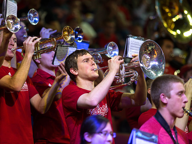
.unl-scroll-fx-fade-in.<div class="dcf-ratio dcf-ratio-16x9 unl-scroll-fx-fade-in">
<img
class="dcf-ratio-child dcf-obj-fit-cover"
src="images/140109_NU_Michigan-1.jpg"
alt="Concise – but descriptive – alternative text.">
</div>
.unl-scroll-fx-move-left.<div class="dcf-ratio dcf-ratio-16x9 unl-scroll-fx-move-left">
<img
class="dcf-ratio-child dcf-obj-fit-cover"
src="images/140109_NU_Michigan-1.jpg"
alt="Concise – but descriptive – alternative text.">
</div>
.unl-scroll-fx-move-right.<div class="dcf-ratio dcf-ratio-16x9 unl-scroll-fx-move-right">
<img
class="dcf-ratio-child dcf-obj-fit-cover"
src="images/140109_NU_Michigan-1.jpg"
alt="Concise – but descriptive – alternative text.">
</div>
.unl-scroll-fx-move-up.<div class="dcf-ratio dcf-ratio-16x9 unl-scroll-fx-move-up">
<img
class="dcf-ratio-child dcf-obj-fit-cover"
src="images/140109_NU_Michigan-1.jpg"
alt="Concise – but descriptive – alternative text.">
</div>
.unl-scroll-fx-children-fade-in fade in from 0 to 1 opacity at a staggered rate when scrolled into viewport.<div class="dcf-grid-halves@sm dcf-grid-thirds@md dcf-col-gap-vw dcf-row-gap-5 unl-scroll-fx-children-fade-in">
<div class="dcf-ratio dcf-ratio-16x9">
<img
class="dcf-ratio-child dcf-obj-fit-cover"
src="images/140109_NU_Michigan-1.jpg"
alt="Concise – but descriptive – alternative text.">
</div>
<div class="dcf-ratio dcf-ratio-16x9">
<img
class="dcf-ratio-child dcf-obj-fit-cover"
src="images/140109_NU_Michigan-1.jpg"
alt="Concise – but descriptive – alternative text.">
</div>
<div class="dcf-ratio dcf-ratio-16x9">
<img
class="dcf-ratio-child dcf-obj-fit-cover"
src="images/140109_NU_Michigan-1.jpg"
alt="Concise – but descriptive – alternative text.">
</div>
<div class="dcf-ratio dcf-ratio-16x9">
<img
class="dcf-ratio-child dcf-obj-fit-cover"
src="images/140109_NU_Michigan-1.jpg"
alt="Concise – but descriptive – alternative text.">
</div>
<div class="dcf-ratio dcf-ratio-16x9">
<img
class="dcf-ratio-child dcf-obj-fit-cover"
src="images/140109_NU_Michigan-1.jpg"
alt="Concise – but descriptive – alternative text.">
</div>
<div class="dcf-ratio dcf-ratio-16x9">
<img
class="dcf-ratio-child dcf-obj-fit-cover"
src="images/140109_NU_Michigan-1.jpg"
alt="Concise – but descriptive – alternative text.">
</div>
<div class="dcf-ratio dcf-ratio-16x9">
<img
class="dcf-ratio-child dcf-obj-fit-cover"
src="images/140109_NU_Michigan-1.jpg"
alt="Concise – but descriptive – alternative text.">
</div>
<div class="dcf-ratio dcf-ratio-16x9">
<img
class="dcf-ratio-child dcf-obj-fit-cover"
src="images/140109_NU_Michigan-1.jpg"
alt="Concise – but descriptive – alternative text.">
</div>
<div class="dcf-ratio dcf-ratio-16x9">
<img
class="dcf-ratio-child dcf-obj-fit-cover"
src="images/140109_NU_Michigan-1.jpg"
alt="Concise – but descriptive – alternative text.">
</div>
<div class="dcf-ratio dcf-ratio-16x9">
<img
class="dcf-ratio-child dcf-obj-fit-cover"
src="images/140109_NU_Michigan-1.jpg"
alt="Concise – but descriptive – alternative text.">
</div>
<div class="dcf-ratio dcf-ratio-16x9">
<img
class="dcf-ratio-child dcf-obj-fit-cover"
src="images/140109_NU_Michigan-1.jpg"
alt="Concise – but descriptive – alternative text.">
</div>
<div class="dcf-ratio dcf-ratio-16x9">
<img
class="dcf-ratio-child dcf-obj-fit-cover"
src="images/140109_NU_Michigan-1.jpg"
alt="Concise – but descriptive – alternative text.">
</div>
</div>
.unl-scroll-fx-children-fade-in can be paired with the data-fx-duration and data-fx-stagger attributes to manually adjust the length of the animation and stagger rate, respectively.<div class="dcf-grid-halves@sm dcf-grid-thirds@md dcf-col-gap-vw dcf-row-gap-5 unl-scroll-fx-children-fade-in" data-fx-duration="1.25" data-fx-stagger=".5">
<div class="dcf-ratio dcf-ratio-16x9">
<img
class="dcf-ratio-child dcf-obj-fit-cover"
src="images/140109_NU_Michigan-1.jpg"
alt="Concise – but descriptive – alternative text.">
</div>
<div class="dcf-ratio dcf-ratio-16x9">
<img
class="dcf-ratio-child dcf-obj-fit-cover"
src="images/140109_NU_Michigan-1.jpg"
alt="Concise – but descriptive – alternative text.">
</div>
<div class="dcf-ratio dcf-ratio-16x9">
<img
class="dcf-ratio-child dcf-obj-fit-cover"
src="images/140109_NU_Michigan-1.jpg"
alt="Concise – but descriptive – alternative text.">
</div>
<div class="dcf-ratio dcf-ratio-16x9">
<img
class="dcf-ratio-child dcf-obj-fit-cover"
src="images/140109_NU_Michigan-1.jpg"
alt="Concise – but descriptive – alternative text.">
</div>
<div class="dcf-ratio dcf-ratio-16x9">
<img
class="dcf-ratio-child dcf-obj-fit-cover"
src="images/140109_NU_Michigan-1.jpg"
alt="Concise – but descriptive – alternative text.">
</div>
<div class="dcf-ratio dcf-ratio-16x9">
<img
class="dcf-ratio-child dcf-obj-fit-cover"
src="images/140109_NU_Michigan-1.jpg"
alt="Concise – but descriptive – alternative text.">
</div>
<div class="dcf-ratio dcf-ratio-16x9">
<img
class="dcf-ratio-child dcf-obj-fit-cover"
src="images/140109_NU_Michigan-1.jpg"
alt="Concise – but descriptive – alternative text.">
</div>
<div class="dcf-ratio dcf-ratio-16x9">
<img
class="dcf-ratio-child dcf-obj-fit-cover"
src="images/140109_NU_Michigan-1.jpg"
alt="Concise – but descriptive – alternative text.">
</div>
<div class="dcf-ratio dcf-ratio-16x9">
<img
class="dcf-ratio-child dcf-obj-fit-cover"
src="images/140109_NU_Michigan-1.jpg"
alt="Concise – but descriptive – alternative text.">
</div>
<div class="dcf-ratio dcf-ratio-16x9">
<img
class="dcf-ratio-child dcf-obj-fit-cover"
src="images/140109_NU_Michigan-1.jpg"
alt="Concise – but descriptive – alternative text.">
</div>
<div class="dcf-ratio dcf-ratio-16x9">
<img
class="dcf-ratio-child dcf-obj-fit-cover"
src="images/140109_NU_Michigan-1.jpg"
alt="Concise – but descriptive – alternative text.">
</div>
<div class="dcf-ratio dcf-ratio-16x9">
<img
class="dcf-ratio-child dcf-obj-fit-cover"
src="images/140109_NU_Michigan-1.jpg"
alt="Concise – but descriptive – alternative text.">
</div>
</div>
Related: Aspect Ratio (Utilities), Images (Elements), Object-Fit (Utilities), Object-Position (Utilities)