UNL Web Framework 5 is the current iteration of one of the oldest sitewide design systems in higher education. Framework 5 was released in 2019 using a new approach: a decoupled Digital Campus Framework containing the foundational underpinnings of any higher ed site expressed in code, and implementing the emerging CSS Grid technology for layout, and a UNL Theme, namespaced and maintained in a separate code library, providing design and branding details exclusive to UNL.
Our website is visited by millions of people from around the globe in a calendar year; along the way they request over 100 million pages a year. In many ways the website, collectively, and all of the college, departmental and unit sites that make it up… in many ways it is the university to anyone who has never set foot on campus. So it needs to be really good; and not just "it was really good once," but it is really good, particularly when judged against the best sites of its time. Accordingly, it must evolve.
While that evolution may consist of major changes, the minor ones also aggregate to significant change over time. Accordingly, we typically release revisions to the framework on the Wednesday following each Web Developer Network (WDN) meeting, at which we go over the coming changes.
The WDN Shared Governance Board determines the timing and scope of changes to the UNL Web Framework.
For Framework 5, we kept many of version 4's visual cues in place, such as navigation in a red ribbon, but we merged more and more from the mobile experience into the desktop experience.
Accordingly, it must evolve.
The biggest, but perhaps most subtle, of these differences is a shift to navigation systems based on topics (for instance, "admissions"), rather than on user identity ("prospective student"). We've long noted this shift occurring in the broader higher ed community and decided this time that we could wait no longer. A culmination of third-party research, and our own review of over 100 large higher ed websites has led us to a new set of primary navigational labels at the top level of the UNL website; long-delayed, these will finally roll out in the summer of 2021: About | Academics | Admissions | Life at Nebraska | Research | Outreach and Impact.
After almost a decade of existence, our use of breadcrumbs as a functional part of the navigation system was retired. What's that, you say? Well, you're not alone… most people never discovered that you could use breadcrumbs in the navigation system to move up to higher levels in the navigational hierarchy. We always thought it was what the word "neato" was invented for. Use of that feature was infrequent, though, and came at the expense of some glitchiness in navigational display. We thought long and hard about retaining it, but ultimately decided, with a lot of input and conversation, to use breadcrumbs in a more standard way. As we're trying to merge desktop and mobile experiences as much as possible to promote learnability, it just made more sense to not have different behaviors for these standardized navigational elements as one went from small display to large display.
New to the header area on desktop is a group of three links to the immediate left of the search: Visit, Apply, Give. These allow supporters and people interested in the university quick access to resources that support their intent.
Speaking of search, search results in Framework 5 are now shown using the entire display area rather than a constrained 'flag;' this may allow us to better communicate the two 'scope modes' of search results in the UNL website. If you're not aware, the search system returns results scoped first to the current website you're on (if you're on the Physics site, the results you see are scoped to that site), and provides an "All of UNL" tab to display the results for the same search for the entire university website. While we're still working on the search layout, we anticipate that we'll be able to display both search results modes in at least some widths.
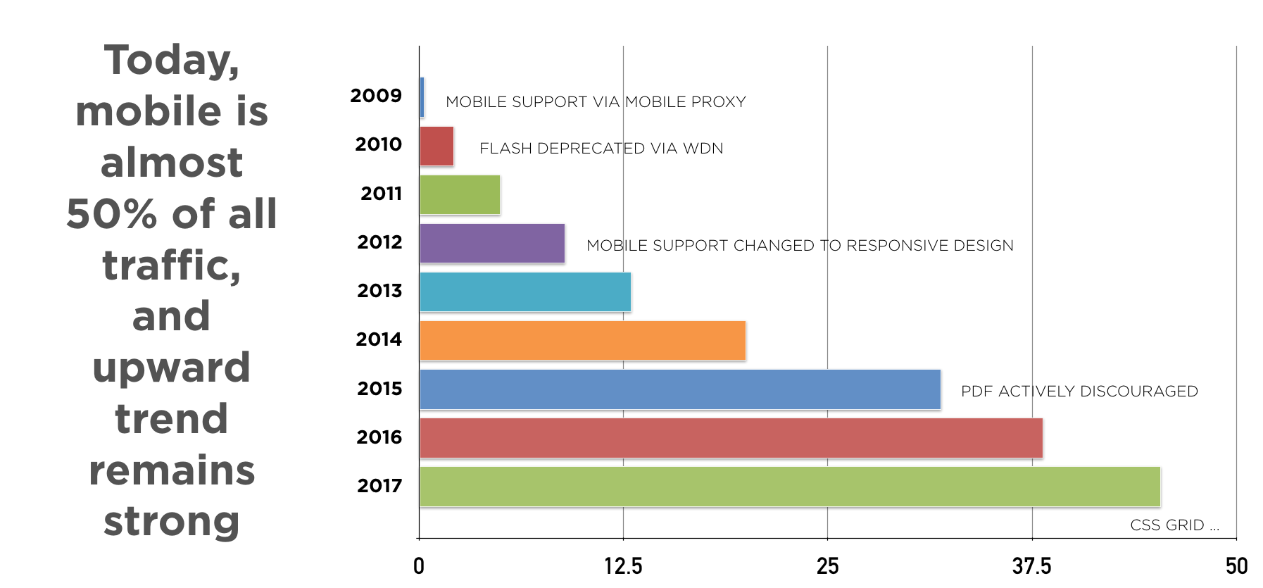
On thing you may not see, but you may otherwise sense, is a focus on performance in this release. We're using more bare-metal web technologies in Framework 5 to make the experience of using our website more immediate. Research has shown that users are losing patience with slow load times on websites. (info here on page abandonment) Mobile use of our website – in terms of pageviews – is today almost equal to use through desktop and laptop computers. We're focusing on performance, and we hope you'll – at least on some level – notice the difference.
CSS Grid is a new way of looking at the problem of rendering a usable website to the thousands of screen sizes in existence.
Speaking of things you may not notice right away, but may over time… Framework 5 is one of the first major websites in higher ed to be built on the next-generation foundation of CSS Grid. Rather than get super-techy here, we'll explain it this way. You've probably heard of responsive design if you've heard of any web technology. Basically, responsive design allows us to build one web page that can flexibly display in an optimized way across the thousands of display sizes in existence. Responsive design is made possible by a creative marriage of JavaScript and CSS, but it should be noted that neither of those technologies were built with that capability in mind.
CSS Grid is a new way of looking at the problem of rendering a usable website to the thousands of screen sizes in existence, and it's now built natively into every modern web browser. It lets the browser itself, rather than external JavaScript libraries, take the entire load of rendering, and as a result it's much faster in painting a web page to a screen.
CSS Grid, though, if it were only about performance, would be a fail. But it's a lot more than that. The CSS Grid module and other CSS3 properties will allow developers new tools and new possibilities for designing and animating content within the standard web toolkit. It's a little like going from the 16-color Crayola set to the 64-color one (with built-in sharpener!). We'll see the results roll out over the life of Framework 5 as web developers at Nebraska revisit and redesign our "digital campus."
P.S. If you have any concerns, or questions, or comments, please join us at a monthly WDN meeting, at a WDN Shared Governance Board meeting, or in the WDN Chat Room.